Accelerating rejuvenation. Last year, a total of 10 luxury fashion brands changed their logo.
Editor’s note: This article comes from WeChat public account “LADYMAX” (ID: lmfashionnews), author Zhou Huining.
The logo has been alienated as a symbol of the premium of luxury brands and has become the second price tag for products.
In recent years, changing logos has become a landmark move for luxury brands to open a new chapter. According to fashion business news statistics, at least 10 major luxury fashion brands have released new logos in 2019, some of which are due to the addition of creative directors, some to create a new image, and some are related to the upgrading of the group’s strategy, but there are essentially One thing in common is that these brands are in a critical period of transformation.
The first to change the logo is the Spanish fast fashion giant Zara, whose performance has slowed down. Last January, the brand released a new logo at the same time as the release of the spring / summer 2019 collection. This is the second time the brand has replaced the logo. Although Zara retained the original Serif serif font, the letters became more slender and compact.
A month later, Massimo Dutti, a brand of Zara’s parent company Inditex Group, also launched a new logo on its app, transforming the classic shield logo into smaller circles around interlocking “M” and “D”. The letter “M” is presented in a sans-serif font, while “D” retains its classic appearance.
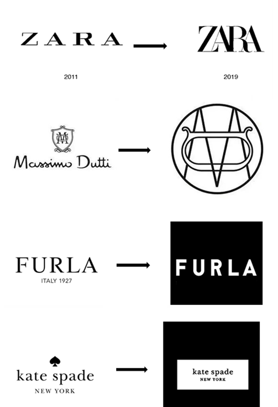
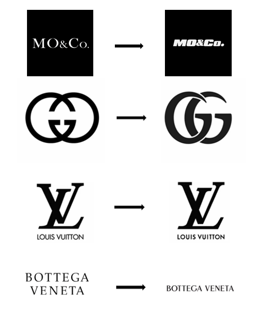
The picture shows the main luxury fashion brands that will replace Logo in 2019. The old logo is on the left and the new logo is on the right.
In this regard, consumers ’opinions on social media have been mixed. Some consumers think that this change is meaningless, and some netizens think that ZaThis move is a signal that the brand will transition to a higher-end market. In the past 12 months, in addition to the new Logo, Zara has also launched a make-up business, expanded its fragrance product line and partnered with high-end perfume brand Jo Malone, aiming to stimulate performance as much as possible based on existing brands Accelerate growth.
As a benchmark for the fast fashion industry, Zara’s move to logo is like a stone falling into a calm lake, and it has started to cause a herd effect in the industry. On March 13, British fast fashion Oasis also released a new logo and launched a new advertising campaign after Zara. The new logo was jointly designed by the brand and Red Bee Creative. The original font was retained, but the color changed to white, trying to redefine the brand’s “cute” image. At the same time, the brand also plans to increase its investment in digital and social media marketing.
Kate Spade, an American luxury brand, also updated its image and logo at the beginning of 2019, and released it with the first collection led by new creative director Nicola Glass. In the new logo, Kate Spade has removed the most obvious logo “spades” and only retained the words “Kate Spade New York”. In the future, the “spades” element will appear in the product design and packaging alone, and the main color of the brand Determined to be pink and the auxiliary color to be green.
In February of the same year, Furla released a new badge logo. The new logo is composed of two symmetrical “F” letters, shaped like a shield, similar to the Italian historic family crest or decoration, but also quite modern. Make Furla’s handbags and accessories more recognizable. In addition, the Furla letter logo font was replaced with the popular sans-serif font in September. The overall lines are thicker than before and increase the visual weight. The brand said that this direct and meaningful way can make consumers more Good to distinguish #TheFurlaSociety from other brands.
In addition to the above brands, the three most watched luxury brands last year also adjusted their logos. In June 2019, Kering’s luxury brand Gucci WeChat public account, Weibo and other account avatars were suddenly replaced with the new double G Logo. The two Gs have been replaced with the same direction from the front, and the font has changed. Bolder and smoother. It is worth noting that this logo first appeared on the Marmont handbags launched by Gucci in 2016.
Bottega Veneta, a luxury brand that also belongs to Kering Group, also quietly changed the brand logo from the previous serif font to a thicker bold in August, making the brand name more prominent and enhancing consumers’ memory of the brand . According to fashion business news, under the leadership of new creative director Daniel Lee, Bottega Veneta hopes to welcome the near futureThe biggest rebound in the third quarter, sales growth approached double digits, up 9.8% year-on-year to 284 million euros.
Louis Vuitton ’s classic “LV” overlay logo was also rarely fine-tuned last year. The letters are thinner than the original, and the brand name font lines under the logo have been bolded. It is more integrated with the letter “LV”. The new Logo has been applied to the official website and WeChat public account since July last year.
It is significant that some people in the industry have noticed that the fine-tuning of the Louis Vuitton Logo took place half a month after the update of the Gucci Logo, which may be considered similar to the “LV” letter Logo. Although neither responded to the replacement of the Logo, this move is undoubtedly another strong smoke among the luxury giants.
At the same time, the trend of changing logos has spread to China. In order to celebrate the 15th anniversary of the brand, domestic women’s clothing MO & Co. Also adopted a logo replacement method to announce the opening of a new chapter, changing the original serif font to a thicker italics, and the brand also launched the eighth-generation store image. The brand has established Coolness in the country for many years and has become one of the most successful women’s clothing brands in China.
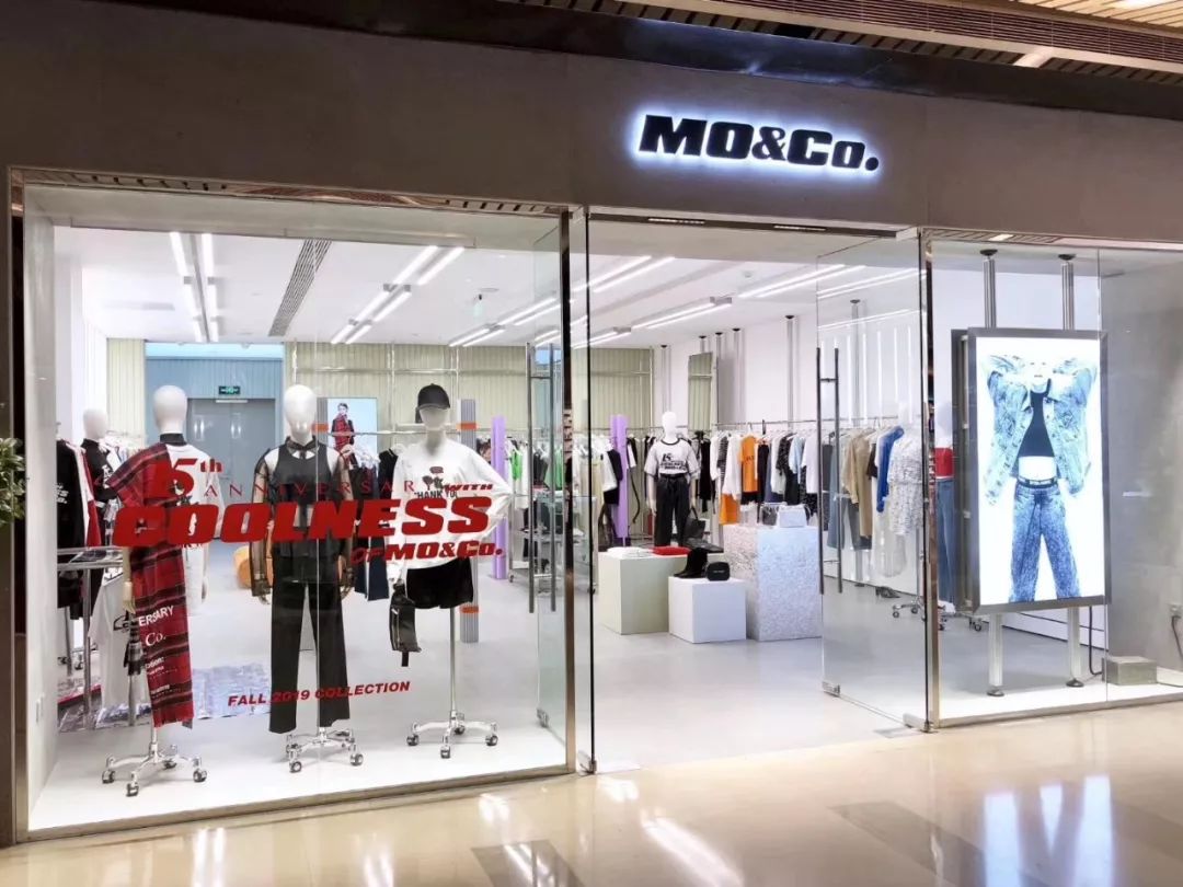
MO & Co. took the lead in changing Logo and started a new process of domestic apparel brand image iteration
Some analysts believe that this time MO & Co. took the lead in replacing the Logo, which opened a new process of domestic apparel brand image iteration, and also revealed the potential of domestic apparel brands to further integrate with global fashion trends. As luxury fashion brands encounter bottlenecks in the European and American markets, domestic apparel brands with innovative capabilities and strong production efficiency begin to usher in new opportunities and rise.
MO & Co.’s parent company EPO Group also includes mid-to-high-end women’s clothing Edition, children’s clothing little MO & Co., men’s clothing Common Gender and makeup brand REC. By the end of 2022, EPO’s brands are expected to cover 80 countries and regions, and the overall revenue will reach 15 billion yuan.
In addition to a single brand, Vans parent company VF Group, which has divested its denim business, disclosed the new five-year transformation plan at the shareholders’ meeting last year, and specially launched a new logo to change the name of the lowercase group.For capitalization, the new slogan was changed to “goal-oriented, performance-driven” to further define the group’s positioning.
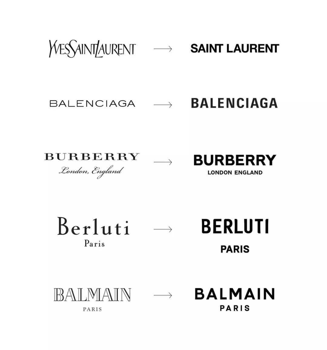
These new logos are surprisingly similar. Most of them use sans-serif fonts, all capital letters, and reduced kerning.
Social media giant Facebook also announced a new logo in November to better highlight its other products, including Instagram, WhatsApp and Oculus. Group Chief Marketing Officer Antonio Lucio posted a post stating that the spelling of the Facebook name in the new Logo is different from the font used for its social media of the same name for many years, and will change different colors according to its different products, aiming to use custom typography and capitalization Letters come to create a visual difference between the group and the application.
In fact, the Logo was originally a concrete embodiment of the abstract concept of “brand”, which aims to convey the message that the brand hopes to convey in the simplest way. In the era of business society, Logo was alienated as a symbol of brand premium. Has become the second price tag for products.
Wechat public account LADYMAX pointed out earlier in the report that from the perspective of motivation, the basic starting point of a brand replacement logo includes, but is not limited to, intentional differences from the brand in the past, showing the market’s determination to change, and making the brand image more consistent with the current aesthetic And its own business, bringing freshness to the market. For luxury brands, the head luxury brands such as Louis Vuitton and Gucci have begun to replace Logo. In fact, the entire industry is undergoing another round of youthful upgrades.
According to the daily statistics of fashion business, in addition to Louis Vuitton, Gucci and Bottega Veneta, at least 7 luxury brands have officially announced brand replacements in the past two years, and luxury brands such as Celine, Fendi, DIOR, and Burberry have also begun to do logos. A new article has been created.
As fashion trends go back to the 1980s and 1990s, Logo, the icon that most intuitively reflects the brand ’s image, is getting more and more attention.
Since the beginning of 2018, items with Fendi Logo have suddenly appeared on social media. Stars such as Kim Kardashian, Hailey Baldwin, Rita Ora, or Nicki Minaj have put on a large area with Fendi’s classic “double F” Logo Printed items.
Fendi’s “Double F” logo was designed by brand creative director Karl Lagerfeld after joining in 1965. One of the “F” stands for “Fur”, the most representative fur of the brand, and the other “F” means With “Fun”, it emphasizes that the brand must be both fashionable and interesting. As the times change, Fendi has recently interpreted the “double F” logo as “Fendi Forever”.
Celine, another luxury brand owned by LVMH, has ushered in a more complete transformation after he took up the new creative director Hedi Slimane. Not only the original phonetic symbols in the Logo have been removed, the letter spacing has been adjusted, Hedi Slimane also emptied the brand’s previous Instagram The post, officially marking the farewell of the Phoebe Philo era with a logo brand, will enter a new chapter.
In addition, the core brand DIOR under LVMH also changed the logo on all occasions and products to all uppercase without official announcement, and reprinted John Galliano in 1999 with Monogram printing in autumn and winter 2018. The Saddle bag, a classic saddle bag.
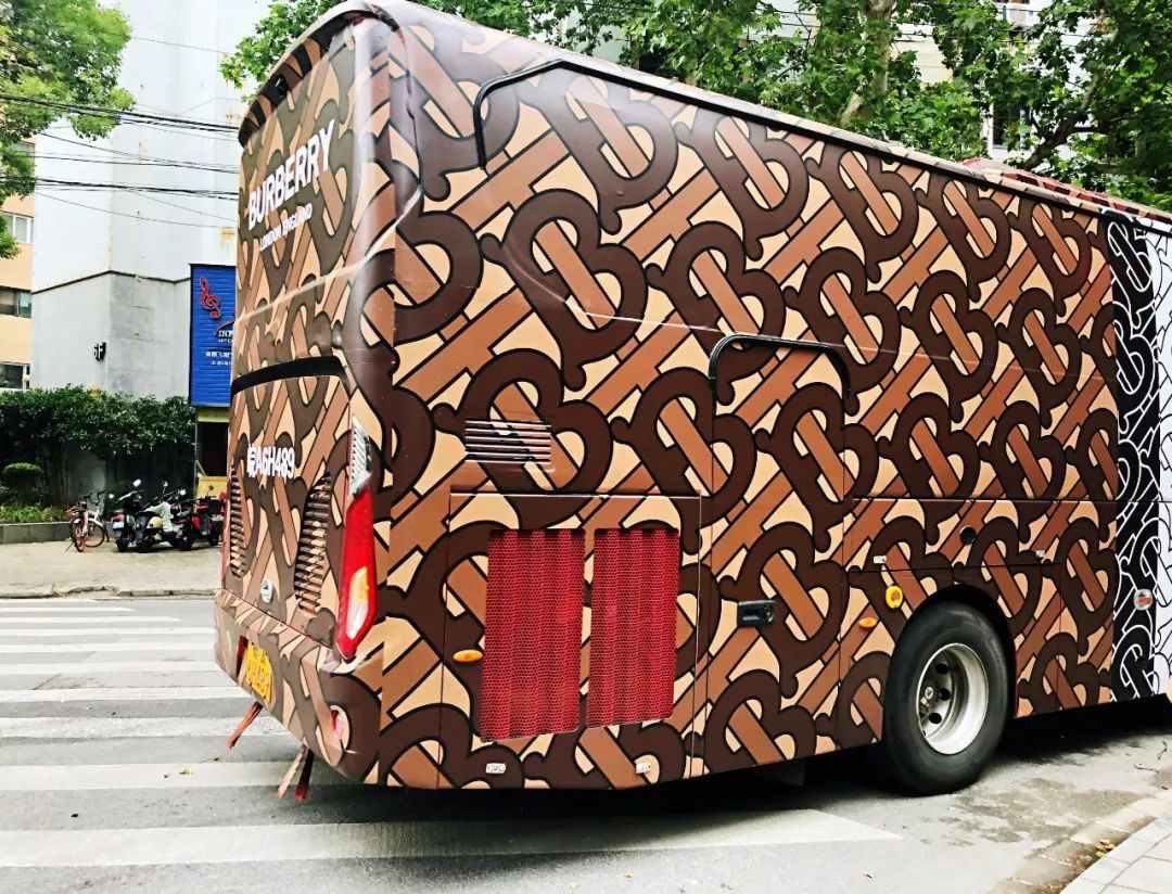
Burberry luxury brand Burberry began marketing large-scale new TB prints designed by creative director Riccardo Tisci and launched in 2018 in major cities around the world in May last year. The first two were filled with the latest Burberry brand prints. Thomas Burberry Monogram’s buses traveled through the streets of Shanghai. Hangzhou Qianjiang New City also staged a large-scale light show with the theme of TB printing, which aims to increase the recognition of the new Logo among consumers as much as possible. It is reported that TB printing is inspired by the brand’s classic logo in 1908. This is the first time the brand has made a subversive change to the logo design in nearly 20 years.
In December 2018, French luxury brand Balmain released a new logo and logo. The font in the new logo has become a more concise sans-serif font, consisting of a circle and the black letter “P” for Paris, and black for Balmain The letter “B” is formed by overlapping.
However, replacing a logo is important for today ’s brands.It is never a simple decision, but has the effect of moving the whole body. Some analysts believe that although the new Logo allows luxury fashion brands to take on a younger trendy ride, this ride may not be the end of the brand’s long-term development.
With more and more luxury brands using sans serif bold letters on their logos, in the world of information that is highly visually oriented and consumers ’attention is easily distracted, Logo is the most intuitive reflection of the brand ’s image. The distinctiveness of the icon may be blurred, but it will lose its recognition.
Columnist Liang Yan emphasizes that trademarks are the first impression that a brand establishes identity and consumers use for identification. For Logo, the change is not just the trademark, but also the design direction, style, image, audience, etc., so Hedi Slimane joined Celine and repeated his rebranding and rebranding in Saint Laurent. Dangerous.
It is reported that LVMH only gave Hedi Slimane 5 series time to increase Celine’s annual sales from nearly 1 billion US dollars to 3 billion US dollars, which means Hedi Slimane only has 2 series opportunities to come A comeback was achieved, and LVMH has begun to weaken Celine’s contribution to performance growth in its latest quarterly earnings report.
To be sure, as the luxury industry landscape changes from stability to turbulence, the round of collective reshuffle of creative directors ends, and the identity anxiety of luxury brands has intensified. Changing the logo is just the beginning, and the challenges ahead are still difficult.