ge-wrapper”>
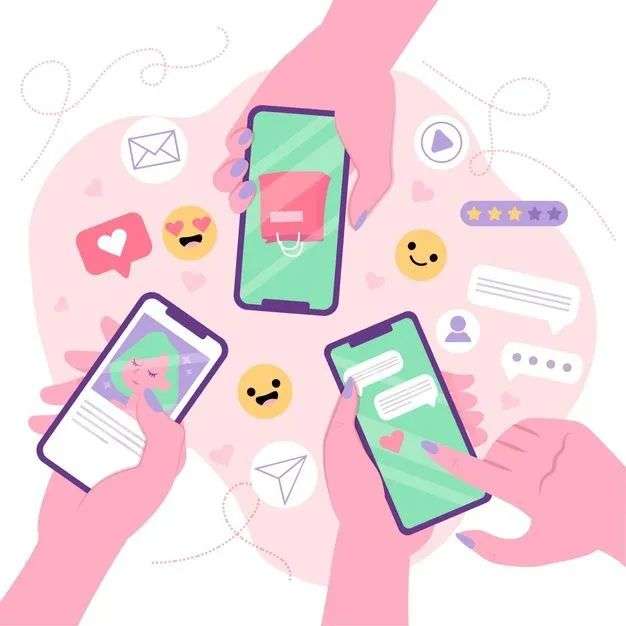
Mobile phones, TVs, computers… People’s lives are full of large and small screens. The Internet itself also means the concentration of countless participants. Each screen medium greatly distracts our time and energy. . Many times, we are not as rational as we think:
How we actually use the web:
1. We are not reading, but scanning
2. We don’t make the best choice, but satisfied
3. We are not going to the bottom, but reluctantly cope
——[America] Steve Crook: “Small Stones: The Web Design Secrets of Visitors First”, China Machinery Industry Press
So, how to distinguish the information on the screen? What information do we really need? The author divides screens into two categories. Physical screen is the information that appears on the screen every day, and Mind screen is what users really care about.
Information overload causes people’s attention to divide, which increases the distance between the physical screen and the mental screen. On the contrary, if the physical screen is closer to the smart screen, the lower the chance of users making wrong decisions.
In other words, to narrow the distance between the physical screen and the mental screen, that is, to achieve a seamless connection between screen information and user needs. For example, Zi Hao Guo and Li Ziqi, the former emphasizes the characteristics of youthfulness and hometown, and the latter creates an atmosphere of idyllic scenery and slow life, which accurately meets the real needs of young urban users. Naturally, it can move people’s hearts and effectively convey product information.
02 Information dilemma, are you cognitively overloaded?
Excessive information will not only lead to distraction, but also increase consumers’ cognitive load and reduce their information sensitivity. Australian psychocognitive scientist Sweller put forward the cognitive load theory, which believes that cognition is a kind of resource consumption, that is, When people learn knowledge and solve problems, they will produce cognitive processing, which consumes cognitive resources.
Most studies have shown that people’s working memory space is limited. When the resources required for cognition exceed the capacity of working memory space, cognitive overload will occur. At this time, it will be difficult for people to retrieve, communicate, and process new information, which increases the possibility of making mistakes.
Although the brain can use hundreds of millions of neural connections to store the knowledge of a person’s life, the number of things that can be stored in the consciousness for a short period of time is limited-on average, about seven.
The American psychologist Miller believes that whether it is a string of numbers, items in the room, a list of words, or overlapping sounds—all there are only 7 items that can be stuffed into the so-called “working memory”—this can be Temporary space for our attention or other cognitive processes to visit. Their retention time in working memory is also very short: Once we no longer actively think about them, they will be stored elsewhere or simply forgotten.
——”We can only remember four or five things in the short term? What limits the capacity of working memory? 》Https://news.ifeng.com/c/7epnK2C0Bh9
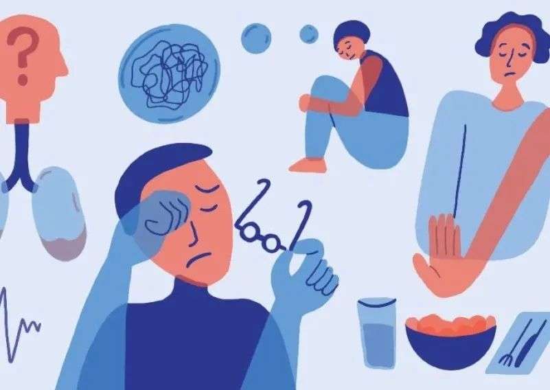
Information overload not only weakens people’s ability to think and make decisions, but also invisibly affects users’ emotions: Flashing little red dots on WeChat, exaggerated headlines, over-enthusiastic pushes…too much feedback The actual increase is invalid information, causing users to feel depressed, fatigue, anxiety and other negative feelings.
“Speed is a form of trance, this is a gift from the technological revolution”, but speed also reduces the time for people to make decisions and increases the pressure of choice. Instead of real-time feedback, it is better to provide timely feedback, to extend the long-term coordinates, allowing users to more calmly evaluate needs and risks and make better decisions. For example, pushing financial products and investment content on paydays is more effective than pushing them every time the screen is opened.
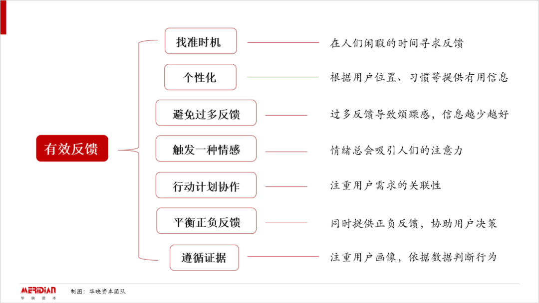
Seven guidelines for effective feedback
03 Thinking dilemma, visual attraction and first impression
Under the pressure of information, we are more attracted to visual images. This may explain the rise of short videos and live broadcasts from the side. Compared with the text form, the visual presentation effect is more direct and the content is richer. Relying on the intuitive thinking mode, we often only rely on the superficial and perceptible first impression to impulse consumption.
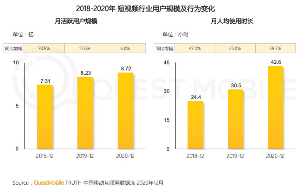
According to Quest Mobile survey data, during the first half of 2020, short videos accounted for nearly 20% of the user’s time share, becoming the second largest industry after instant messaging. As of December 2020, the scale of short video users is still expanding, especially the per capita use time of short videos has increased significantly.
The unconscious preference of the visual system, namely the location of content and the way people pay attention, may play a pivotal role in thinking. In the case of high cognitive load and short decision-making time, people will first pay attention to the information at the center of the vision, ignore the information at the edges and blind spots.
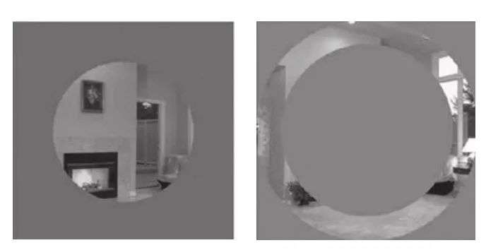
Adam Larson and Lester Loschky (2009) did an experiment. They prepared photos of daily scenes such as the kitchen and living room, covered the periphery or the center of the photos, showed the photos to the subjects, and then asked the subjects to judge what scene they saw. They found that photos that are hidden in the center are still easy to identify, while those that are hidden aroundPhotos, people can’t tell if it’s the kitchen or the living room. ——[美] Susan Weinschenk, Xu Jia, Ma Di, Yu Yingyi Translated: “Designers Must Understand Psychology”, People’s Posts and Telecommunications Press
Therefore, when designing the screen, it’s best to put important details in the central vision or where the line of sight is most likely to pass, away from the edge area, and Horizontal presentation reduces the interference of surrounding visual elements (such as flashing advertisements, animations) and increases the possibility of key details being noticed.
04 How to solve the difficulty of choice: information architecture + choice architecture + thinking architecture
Information overload is not the original sin of selection difficulties in the multi-screen era. At its root, the problems that cannot be solved by technology are the key. Humans are not “Pavlov’s dogs”. Nowadays, we need to inject humanity thinking into the screen.
On this basis, the author provides us with a behavioral toolbox to solve the three dilemmas, using the tools of information architecture, selection architecture, and thinking architecture to solve the “difficulties in selection” in the multi-screen era disease”.
Information Architecture
The most important thing about the blur and cumbersomeness of the screen is to subtract the screen design. Content providers need to provide concise, accurate, and effective information to change the way users behave.
In the design of the text content, increase the “screen reading” difficulty, and find the balance between ease of use and necessary difficulty. Make use of changes in font, font size, and brightness to introduce necessary difficulties when reading, show unsmooth information to users, increase the possibility of their careful thinking, and let users slow down.
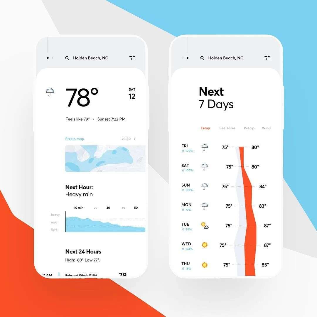
At the image level, focus on the “visualization” of content, and express textual information in the form of images.For example, the weather forecast can express the size of precipitation by the size of raindrops, and use elements such as curves and color blocks to show the trend of change.
Select architecture
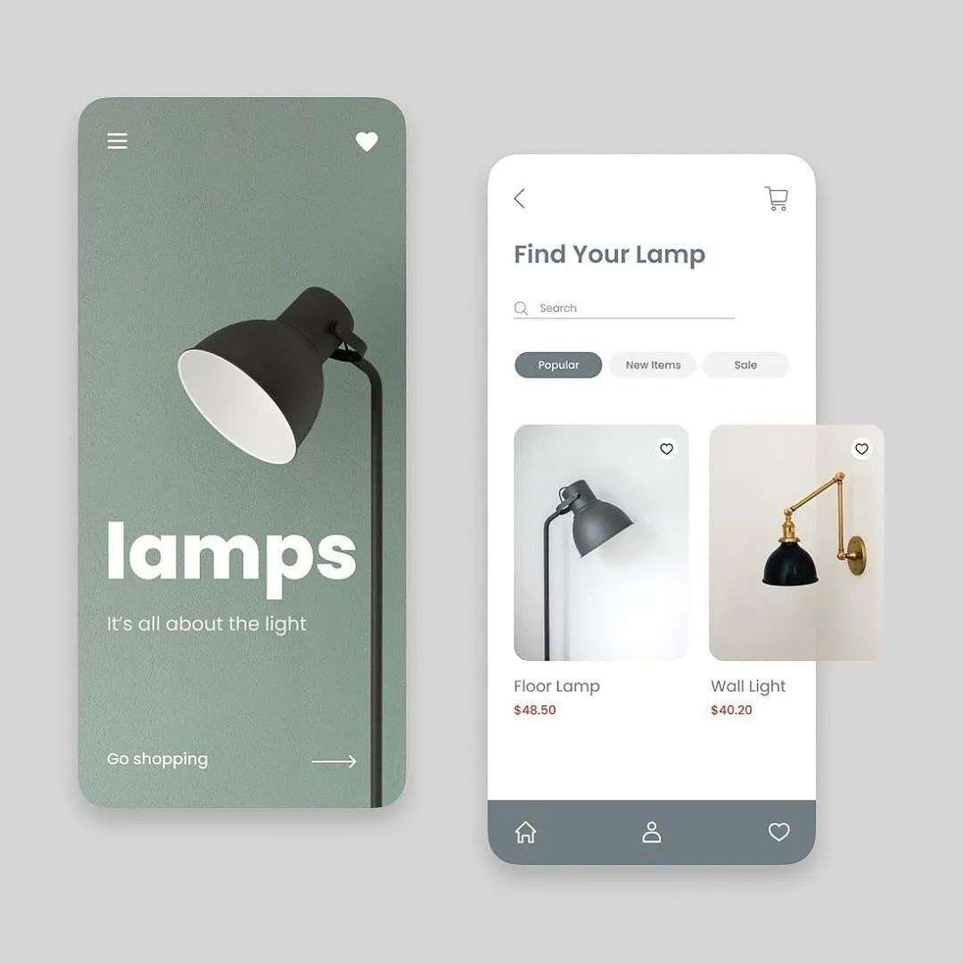
Personalized products are an important direction for the future retail industry. Personalized expression is actually to create a connection point for consumers to examine the real world and the spiritual world, and to realize the user’s psychological projection and sense of identity. Content providers need to combine specific life scenarios, through personalized guidance, let consumers perceive the uniqueness of the product, create a customized experience, and use screen design and product layout to influence user choices.
Based on user consumption records, recommend customized wealth management products
Thinking about the architecture
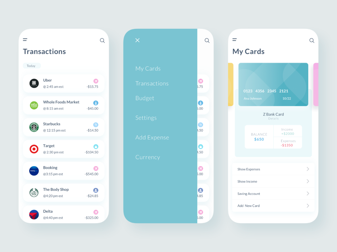
What users need is not endless possibilities, but effective option management. Content providers naturally cannot “throw” a basket of information to users—providing users with a list of categories is the right answer. Content providers can help consumers narrow the range of choices on the screen by dividing page areas, guidelines, and navigation signs, streamlining to the optimal set of considerations, and allowing users to clarify the priorities of various information and choices.
1. Three-click principle: If users can’t find information and complete website functions in three clicks, they will stop using this website.
2, Choose the end method: Some very subtle actions will make people feel like the ritual is over when making difficult decisions, so as to avoid a downward spiral of regret situation.
The author emphasizes in the book: In the future world, people’s interaction with screens will be moreFrequent; Whoever can take the lead in using the screen to guide customers to make smart decisions will be able to seize the new consumer era.
Nowadays, the development of multi-screen and cross-screen has gradually led to a new round of changes in information dissemination. However, the most important thing is to insight into users’ minds and grasp the spiritual core of the times. Go from the complex to the simple and return to the crowd.