A lot of times, when we talk about font design, we tend to analyze it from the perspective of aesthetics and sensibility. However, in many cases, fonts create “functional tools” designed to solve specific problems.
Today, let’s look at a more specific set of “functional fonts” – Atkinson Hyperlegible, designed for the visually impaired, is designed to provide greater discriminating power.
The visually impaired is not just blindness, but includes vision that is different and cannot be corrected by ordinary methods such as glasses. Decrease and obstacles. In other words, not all visually impaired people will use Braille, and they may also read the information to get information.

▲ Image from Unsplash
In order to better serve and reach the visually impaired, the Abilleson Hyperlegible font was designed in collaboration with the Braille Institute, a non-profit organization that has been established for over a hundred years, and the design company Applied Design.
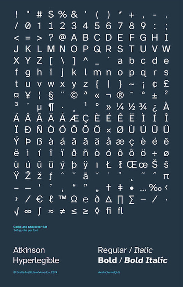
▲Atkinson Hyperlegible font. “Atkinson” is the surname of the founder of the American Braille Academy, and “Hyperlegible” means “super clear and easy to read”. The picture is from Applied Design< /a>
At first glance, this set of fonts doesn’t look anything special.

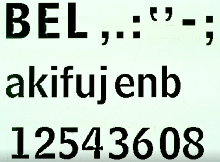
▲ Use the text of the Atkinson Hyperlegible font, from Applied Design
In fact, this set of fonts has worked hard on many details. For example, create discerning details for easily confused letters.
In the case of “B” and “8”, the lower part of “8” is deliberately designed to be wider, so it will not be confused with “B” in case of ambiguity. The numbers 1, uppercase and lowercase letters I and lowercase L (“1”, “I”, “i” and “l”) are also very confusing numbers and letters are given unique details.
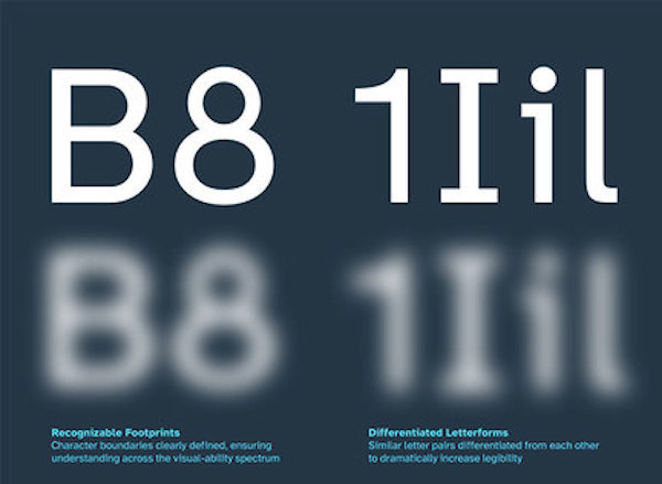
▲ Figure from Applied Design
In addition, visual traits such as curves and openings in letters are also more exaggerated. For example, the “gap” of the letters “C” and “3” are wider than usual, and are better recognized in case of ambiguity.

▲Figures from Applied Design
One of the issues that Scott and I talked about from a creative perspective is that our design will break the design rules that many designers care about, which may make us unpopular.
Craig Dobie says she is the creative director of Applied Design. Indeed, the capital letter “I” exists in a neat and simple sans serif, but the lowercase “I” carries a small hook like a serif, even Dobie, they are silent in the design halfway through. “This is really true.”
At the same time, how to control the “exaggeration” of the details of letter recognition becomes another challenge.
In theory, designers can exaggerate all the details that can help identify, but this will make non-visually impaired people very hard. As a result, Applied Design is constantly fine-tuning in the design process, and invites visually impaired people to try reading to better grasp the balance between the two.
According to Fast Company Report, the college is still continuing to optimize this set of fonts with Applied Design. In the future, this set of fonts will be open to all designers. In addition, the news that both Apple and Microsoft are communicating with the American Braille Academy, adding Atkinson Hyperlegible to its operating system.
Fonts have been developed based on media changes
passExamples of designs designed to increase the readability of fonts have always existed in the history of font design.
Britain’s famous font designer Matthew Carter on the design of a lot of unique fonts, overcome the Restricted by the age of the media, creating a higher definition of the font.
▲ Matthew Carter has been designing fonts for more than 50 years, witnessing media changes, from Hypocrite Design
In the printing era, Carter designed the “Bell Centennial” font for a densely packed phone book.
▲ Feel the density of content in previous phonebooks, from TED
What everyone doesn’t know is that the fonts used for printing above are actually grown as follows.