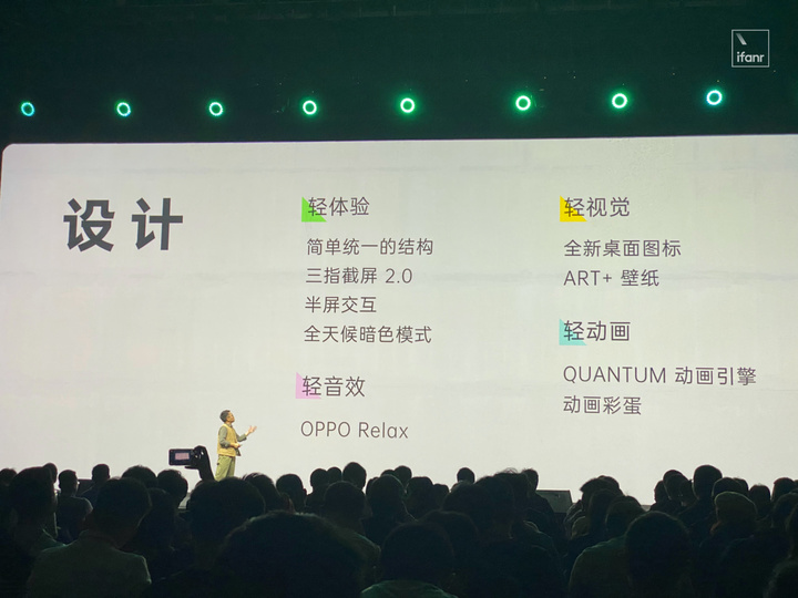
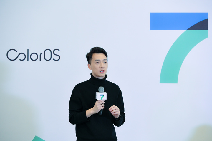
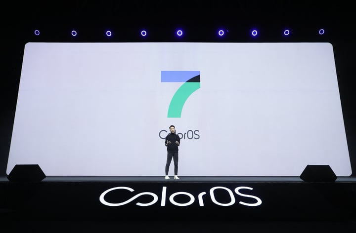
On November 20th, the new ColorOS 7 official release. In addition to the visible updates, many highlights of the new system were mentioned at the event, including changes and updates to the “Borderless” design, the new QUANTUM animation engine, flashback keys and all-weather dark mode. It also shows that ColorOS changes in interaction and compatibility.
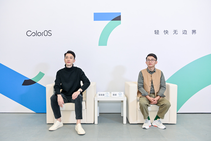
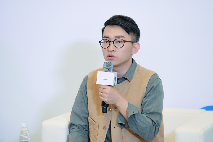
For these new changes, we also interviewed Chen Xi, chief designer of OPPO ColorOS, and Zhang Haochen, product director of ColorOS, to explain the reasons for these updates on OPPO ColorOS and the overall openness of the system.
“Borderless” design, emphasizing the change of “fusion”
As early as OPPO Find X was introduced, ColorOS actually proposed a “borderless” design concept.
Ai Faner mentioned in an interview with Chen Xi that the concept of borderless design was actually due to the appearance of ultra-high-screen mobile phones. It is not appropriate to continue to use the border design before continuing. In order to better integrate the interface into new devices, ColorOS has also proposed a “borderless” design concept, hoping to achieve the goal of “no borders on the screen, no borders in design”.

Compared with the old design, the “Boundless” design is mainly to lighten the concept of line spacing between cards and lists. By optimizing the line spacing and font spacing, and adapting the corresponding animation effects, it can bring out ” Features of borderless design. In the previous interview, Chen Xi said that this idea actually comes from the whitening techniques of traditional Chinese art works:
For example, some works by Ma Yuan, the master of Southern Song painting, are avant-garde even from a modern perspective, because Ma Yuan has used a lot of white composition.
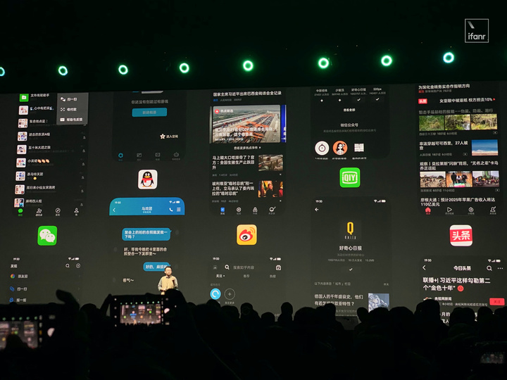
Reduce the obvious interval here, and change the positive and negative spatial relationship between the font, icon and background in the interface by “whitening” to make the whole more tidy. When dealing with text-intensive images like “information”, the new design can make this kind of information-intensive interface soothing, reducing the pressure on users to receive information, and achieving the effect of simplifying.
Now, the borderless design has undergone some iterations of ColorOS 6 to ColorOS 7, and there have been some changes. In the interviews related to ColorOS, Chen Xi repeatedly mentioned the keyword “fusion”:
In fact. The layout of the borders listed in the past is from the Oriental elements. We think that Apple or Android’s native design is more Western, Western culture, Western art genre, and art genre exist for confrontation. For our Oriental culture, we will emphasize the relationship of integration. So in essence, ColorOS advocates such a spirit of integration.
In the interface of ColorOS 7, most of the design has been reduced to the utmost extent, and various lines for segmentation have been eliminated. This is also a “white” and simplified thinking that conforms to the borderless design. It is also an element that continues on ColorOS 6.
When it comes to convergence, here is the new all-weather dark mode that ColorOS 7 has added.
This all-weather dark mode is not only compatible with its own interface and applications, it now supports 45 third-party applications, allowing applications to follow the system’s dark mode when they don’t have dark mode turned on or they don’t have dark mode options. OPPO also stressed at the press conference that more third-party applications will adapt to this model in the future.
The fusion mentioned by ColorOS also includes third-party adaptation and visual unification of all-weather dark mode,
Because it’s not difficult to achieve visual unification in your own application and system interface, but if you want to adapt it on a third-party application, it will be much more troublesome to operate. After all, even if you only need to adapt to the regular application, the workload of the adaptation is large, and the operation is cumbersome. It can also be seen here that ColorOS is spending a lot of time on the pursuit of convergence.
What is “light”
OPPO also emphasized the “fast” selling point when ColorOS was released.
The proposed “borderless” design of Chen Xi believes that not only is the application simple, the operational response speed is improved, but also a reflection of the cumbersome and more lightweight system:
The change of ColorOS 7 is not only the surface style, but also the interaction logic and the auditory system. “Lightness” is not just a visual experience, but also listening to the sound, it will not make people a heavy one. Use experience.
Based on this main design, lightweight operation, ColorOS 7 has also added a lot of new changes.
If you add a new flashbackThe key is a design that reduces the number of round trips between applications. When the flashback button is enabled, it will prompt important information on applications such as games, navigation, and car software, with a corresponding countdown. The user only needs to switch according to the prompt on the button, so that the information will not be missed, and the time wasted because of multiple application switching.
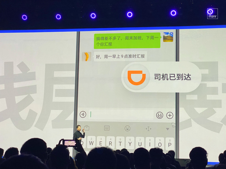
After all, the flashback key deals with the waiting scene. The application in the waiting state basically does not need any operation. The user only needs to know when to switch back, so even if multi-tasking is used, the efficiency is used here. There may not be a flashback button, and it will take up display space. It can be seen that the flashback key can improve the operation efficiency and make the whole more reasonable.
Of course, the new mode of operation will only guide the user in interaction, let them choose some operations that improve efficiency. If you want to make the phone experience faster, then the underlying optimization is still indispensable.
In this regard, Zhang Yuchen also talked about the underlying optimization of the system. The optimized ColorOS 7 adds end-cloud intelligent compilation technology, self-learning user application habits, intelligently optimizing system hardware utilization, and achieving memory utilization improvement. 40%, system fluency increased by 30%, and response speed increased by 15%. These are also the faster aspects of ColorOS 7 speeding up.
For fast, the definition of OPPO will not only stay at a simple speed. What they are asking for is not direct demonstration of simplification and speed improvement, but on the basis of the underlying optimization, let users feel the efficiency improvement, but the overall operational sense will not become blunt:
We are not pursuing the ultimate simplicity, nor the “stupid fast” that turns off animation and transition. Our philosophy is that comfort is fast, natural is fast, not fast, hard, and silly. These are the two most essential differences. For example, opening an animation is slow, but the response is very fast. The anchor point is that the animation is slow, but the response is fast.
A more open attitude
In addition to speed improvements and design changes, ColorOS 7 also involves more content related to third-party applications, as well as user-defined openness.
When it comes to flashback key design, there are some third-party application access and interface open issues. In this regard, product manager Zhang Yichen said that these open and cooperation is not the more the better, ColorOS is actively considering more three-party applications, but also consider the user’s usage scenarios. Adaptation will only occur if the appropriate application is encountered:
When we communicate with the three parties, many of our partners are gradually understanding us, so when we first communicate, we must pass some common user scenarios, such as we dig some partners today (Baidu map , Didi) are very active with us, then we will take the initiative to gain some insight into the rigid needs, you will find that this scene is not the more the better, in fact, the final information interference. So we will open this thing on the one hand, let more three parties communicate with us, and we will actively refrain from restraining this function.
Exactly, from the flashback buttonAs can be seen in the design and proprietary compatibility list, this is more of an application that has more latency during use and can also switch based on timing.
For a taxi app that needs navigation or waiting for a response, there is a longer game with no time to play, and these will be integrated into the meaning of the flashback button. If a piece of software only needs to be loaded for a long time, and this wait has no other effect, then ColorOS will not adapt it to the flashback key function.
However, although they will carefully select partners based on usage needs. But from the perspective of the entire operation and product thinking, ColorOS still has an openness to cooperation. In this regard, Zhang Yuchen also said in the interview:
Either active adaptation and mining, or open to third parties, we are doing, we also hope to provide more ideas and functions with the three parties to see what this product can develop into.

So, the content related to ColorOS7 access is mainly concentrated here. What we saw in this system iteration is not only the evolution of ColorOS based on Android’s functional changes, but also the image they want to show through these new features and new designs. In future versions of the update, “light”, “open”, and “fusion” should be the core elements that ColorOS will maintain.
Or we can see the new changes and experiences of ColorOS on 5G models in Reno 3 released later.