Design Considerations for 30 Mobile Apps
The Translation Bureau is a compilation team that focuses on technology, business, workplace, life and other fields, focusing on new technologies, new ideas, and new trends.
Editor’s note: Good apps are favored by users. In addition to the functions of the product itself, product design is one of the key factors. This authorizes an article translated by software engineer Nick Babich. The original title is 30 Things We Often Forget When Designing Mobile Apps. Nick shared in the article 30 aspects that are easy to ignore when designing a mobile app. I hope you have something to do with it. Inspired, this is the middle of this series of articles.
Lazy directory
One, registration and login
Second, first experience
Three, daily user experience
Four, notification
V. Account Settings
Six, information presentation
Seven, in-app search
eight, app store
Image source: MD RUBEL RANA/Dribbble
Three,Daily User Experience
7. Allow request interface
When a user first uses an app, the last thing they want to see is a variety of pop-up permission request notifications. For example:
-
“App Name” wants to send you a notification
-
“App Name” wants to get your contacts
-
Allow App Name to enable camera or microphone access
Similar to allow request pop-ups, the user experience will be greatly discounted, and even the possibility of users eventually deprecating the app. Therefore, it is recommended to choose to pop up in the context of the user interaction process. It is best not to pop up a similar permission request when the user opens the app.
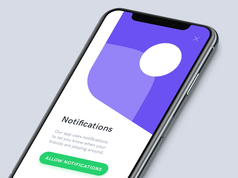
Allow notification pop-up design. Image source: Anton Tkachuk
8. Various states of user interface interaction elements
On the mobile app side, buttons and other interactive elements in the interface are usually presented in multiple states. Therefore, it is worth noting that there should be a significant difference in the design of each interactive element on the mobile interface in the default case, the user’s choice or press, and cancellation.
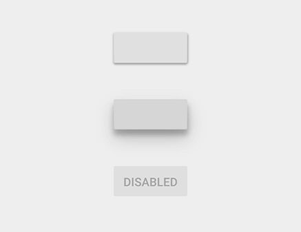
Three different display states for the same button.
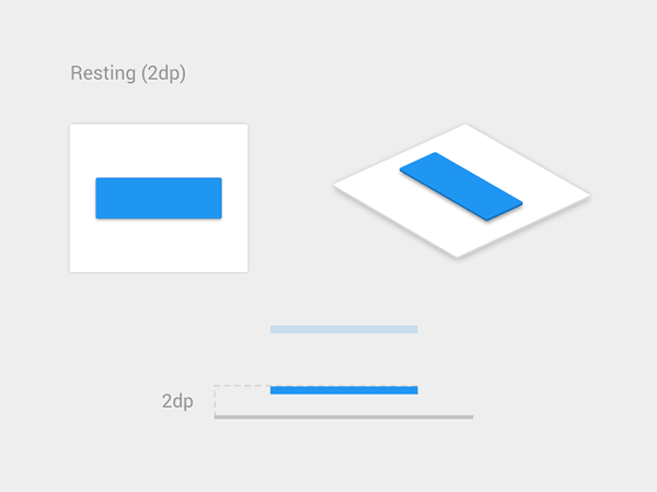
Material design button. Image source: Vadim Gromov
9. Icon System
If all the icons in the interface are of the same design style, it is easier to visually achieve uniformity and maintain a certain aesthetic.

Tagbar icon in Twitter’s iOS client
There are four suggestions for the design of interface icons:
-
Easy to identify. Don’t choose a frame icon that you don’t know, otherwise it may cause difficulty in user identification.
-
Visually pleasant. Try to minimize unnecessary flat detail elements, while also adding animation and added interaction and fun.
-
The size is right. On the mobile client, it is recommended that the size of the target icon be controlled within the range of 7 to 10 mm.
-
Overall unity. From a design perspective, overall unification is a very important design principle. In addition to maintaining the unity of the overall design style of each icon, it is also necessary to ensure its uniformity between different client platforms.
10. Error status
The best error message is information that will never pop up.
In general, it is best to correctly guide the user to interact correctly with the product in the first place, so as to avoid errors in advance. However, when the error is really unavoidable, designing friendly error messages not only guides the user how to “get on the right track” correctly, but also prevents the user from feeling that he or she is not valued.
Error message. After clicking the “Continue” button, a red prompt appears in the Applicant box to remind the user that they need to fill in the relevant information. Image source: Dwinawan
For the design of error status prompts, you should pay attention to the design of the following three situations:
-
No network connection.
-
The user entered an error message or missed the information.
-
System error.
11. Load interface
Although it is the best state to ensure timely and rapid interaction between the user and the app. However, sometimes the loading speed of the app is not satisfactory.
For example, network connectivity issues can cause slower system response times or longer response times. In these cases, in order to reduce the user’s irritability, what you need to do is that the user can feel andUnderstand that the system is processing their operational requests.
If this is not possible, the user will not be able to understand that a certain load time may be required behind an operation request, which may cause the user to unilaterally think that the App has failed. In some cases, users will even repeat the operation, and this operation will only make the system more responsive.
Therefore, in the loading interface, you can show the user the animation progress bar indication that the system is loading, which is one of the commonly seen solutions.

Smile-style animation loading interface. Image source: Gleb Kuznetsov✈
12. Success Status
The so-called success state is an interface that shows the user that an operation or interaction process has been successfully completed.
When designing a successful state, designers should consider the following two aspects:
-
Pleasant state (first success). This time when users complete an important interactive task for the first time, it is often an opportunity to create a friendly emotional connection with the product. It is recommended that users understand the progress of their interactions, let them know that their interaction process is very smooth, and share this successful moment with users.
-
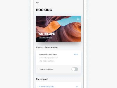
Confirm the interface. For e-commerce applications, the final confirmation interface is indispensable. When the user successfully places an order and completes the payment, he or she needs to display a confirmation interface about the important details of his order.
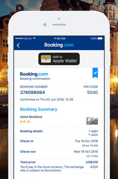
Global hotel online booking application Booking.com confirmation interface.
13. Fill in automatically
As far as designers are concerned, it should always reduce unnecessary user interaction during the interaction process, thus reducing the cost of user interaction. “automaticBy filling in the “features, you can simplify the user interaction process and experience by reducing the amount of information the user enters.
Automatically fill in the example. Image source: Louise Chang
14. Undo operation
In the process of using digital products, anyone can accidentally appear an operation error. However, it is worth mentioning that when it comes to user experience, it is necessary to provide relevant operating options so that users can revoke and restore their original important data information.
Undo deleted items. Image source: Sashoto Seeam
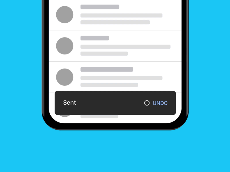
Remove sent mail. Image source: Tyler Beauchamp
15. Localization and Internationalization
Because many product teams end up with ambitious plans to get products globally, in the design process, localization and internationalization must be emphasized.
In the product interface, the visual characteristics (such as size) of each interface element need to consider factors such as localization and internationalization. For example, if the text of the same operation button is different in different languages, the length of the text may be different, and the button design needs to be adjusted according to the actual situation.

Like in different language versions. Image source: Chier Hu
16. Help documentation
When users encounter problems while using the product, their first reaction is naturally to find the solution in the App. Therefore, it is recommended to provide users with a link to a help or question and answer page in the app.
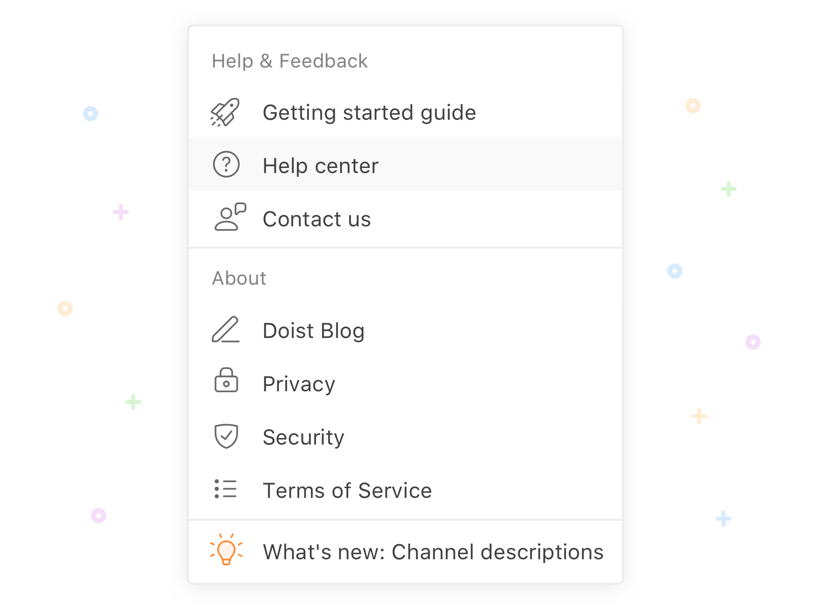
Help and feedback page. Image source: Alex Muench
17. Accessibility
The so-called accessibility, in fact, it means that users can normally understand, understand and interact with the product.
There are four main recommendations for accessibility design:
-
Designed for flexibility. In combination with our finger size, it is recommended to leave at least 9*9 mm of the interface elements on the mobile side, while leaving a small space around the element that will not be activated. To prevent accidental clicks or touches, an action should only be activated after the finger leaves the screen. In addition, in order to adapt to the range of thumb movement, the most commonly used interface elements should be placed within the range of thumb movement, of course, also pay attention to whether the user is a left-handed or right-handed and other specific conditions.
-
Designed for hearing. Undoubtedly, there may be some hearing impaired among the users who use the product. Therefore, when designing the audio content portion, it is best to let the user choose to present some of the content in text form; for video content, the relevant non-verbal elements should also be assisted by text or subtitles.
-
Designed for the visual. For users with visual impairments, designers must pay attention to the contrast color of the interface and the overall information architecture. The interface design must pay attention to visual clarity and contrast. The color chosen must comply with the relevant standards.The text should be readable after being magnified twice.
-
Designed for the way we understand and understand information. The design and presentation of the overall information architecture is also critical for people with cognitive impairments. First of all, it can be designed according to the principle that “important related information is large”, allowing users to recognize the most content in the least interaction. Of course, maintaining the overall unity of the page also helps the user’s understanding and understanding. Second, language can be used to aid understanding and use. Designers need to be readable and understandable on the mobile side. As far as English is concerned, one of the golden rules of design is to use vocabulary that does not exceed the level of education in grades five through seven, so as to ensure overall readability.
Extended reading:
30 aspects that are easy to ignore when designing a mobile app (top)
30 aspects that are easy to ignore when designing a mobile app (bottom)
Translator: Junyi