With the same function, the design of each APP is different. why? What are the decision factors that affect interaction design?
Editor’s note: This article comes from “Everyone is a product manager” (public ID: woshipm) , author | 熊 不知.
When you play with various apps, you should often find that the same function, the product design scheme made by each app is different. Why is this? So many different solutions, which one is better? How can we compare them?
These questions are translated into the following: What factors should be referred to when interaction design needs to make decisions?
I selected 13 cases this time, and analyzed these questions while answering these questions.
Different scenes
Requirements grow out of the scene and should be solved in the scene. The so-called scene is actually a combination of people, time, place, object, terminal, and process. With the same function, the characters / time / place / object / terminal / process are different, that is, the scenes are different, so the solutions are also different.
Screening function (e-commerce VS Online Dating)
It is also the filtering of the list page. We compare two different types of apps. One is an e-commerce category app: Taobao, and the other is an Online Dating category app: JION.
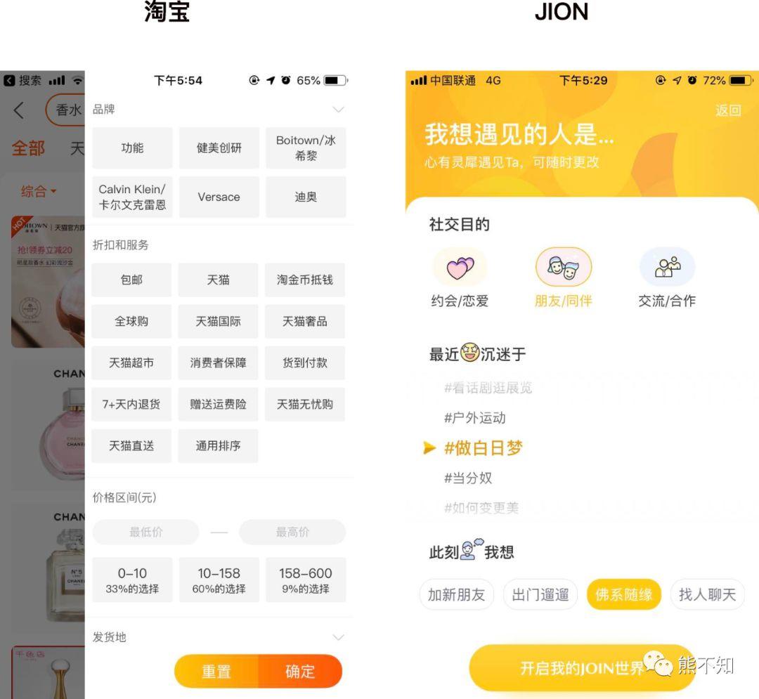
Speaking of the filtering function, we are probably most familiar with the filtering function of the product / service list page. Just like Taobao above. Designs like JION are rare.
Why are designs so different? Because the filtered objects are different.
Taobao’s filtering object is items. Items are standardized, and items are not emotional, only a bunch of fixed features and attributes. So Taobao’s screening page characterizes the product. You can find the target by filtering these characteristics.
But JOIN filters people.
People are not standardized, and it is difficult to classify them like objects. You might say that people can also tag? Yes, but if it really comes through tags, countless tags may be needed. This is obviously not economical. In addition, the use of tags to screen people, materialize people, in a dating category of the app seems a bit disrespectful of people.
So JION uses another solution: instead of blindly looking for some tags, we should ask ourselves first.
People are divided into groups. The person we are looking for is actually someone similar to themselves. So instead of putting your foothold on people of inductive gender, it is better to put it on yourself, ask yourself, and recognize yourself. That’s how JION asks, what do you want to do? What’s your recent status? What are your thoughts at the moment?
Provide your own status and ideas, and have a feeling of communicating with others face to face, rather than rough selection of goods. Respect for yourself is also respect for others. We are looking for people, not goods, and we should have a minimum of respect. The bottom line of respect is not to materialize others. You can have a ruler in your mind, but at least politely, don’t let go of the ruler at will, and compare others at will.
So JION’s filtering page is not the same as the filtering function of the service / product list. Instead, it takes a different approach and creates a demand submission page that highlights the characteristics of people and their temperature. Through our search for self and respect for others, saying “no” to materialized personality can also improve efficiency and find people who suit us.
So I think the design of JION is a good design and a scene-driven design.
Home of travel plan (bus vs taxi)
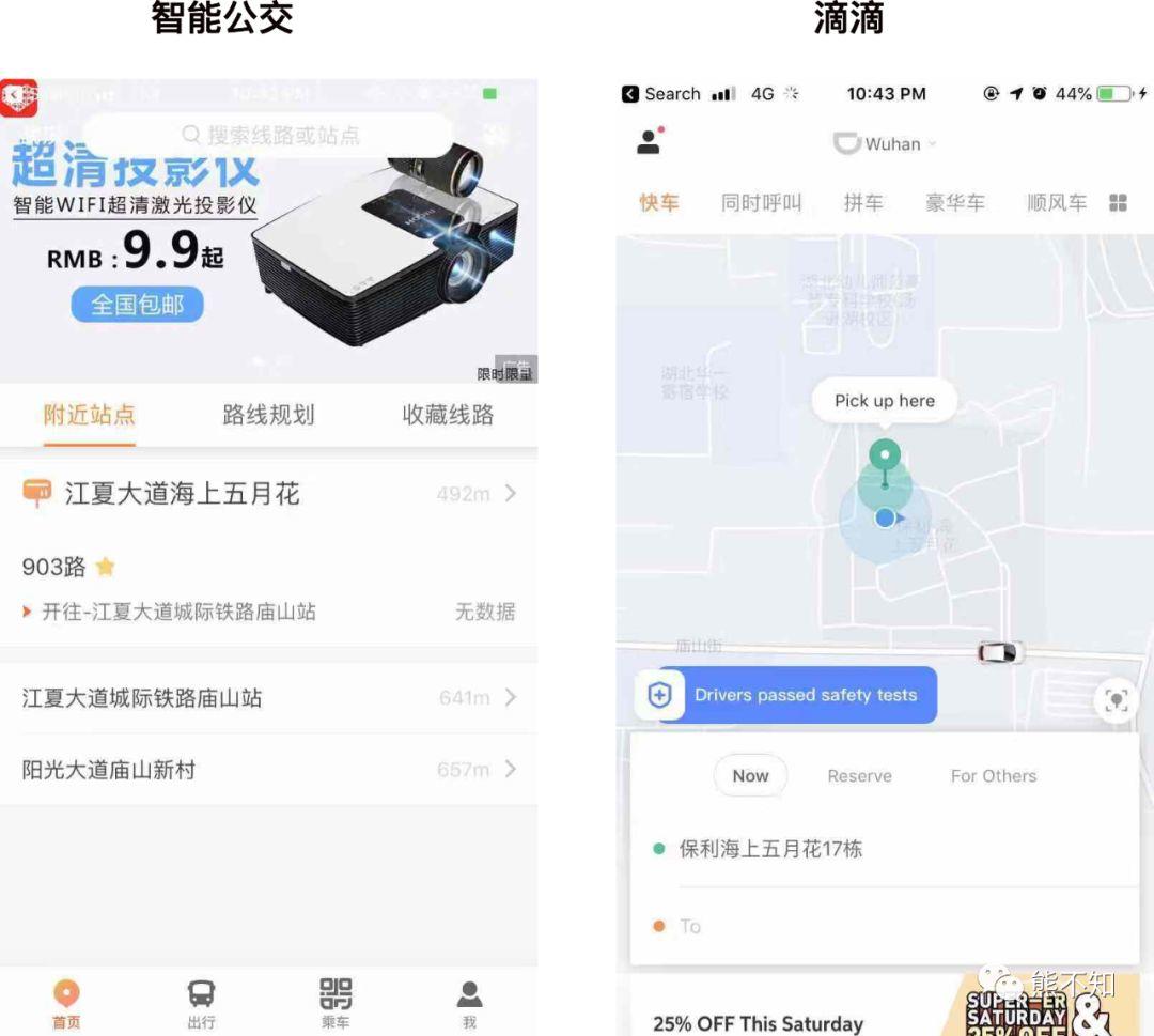
The homepage of the smart bus does not have a map, but only nearby stations that are located. The home page of the taxi app is the map, you can check the car and road conditions.
It’s the same travel plan, but the design is different because of different transportation. Smart buses are used to query bus lines. The bus lines and stations are fixed. We just need to know the nearby stations and the arrival of vehicles.
Taxi is different, the location is different, the number of vehicles is different, and the distance from us is different. After the taxi, we need to know the real-time distance of the vehicle. So need a map.
Different development stages and characteristics
It is also a comment function. Other apps, such as Knowledge Planet and other communities, encourage users to comment, but Weibo reminds: How many people the blogger has recently hacked, please be careful.
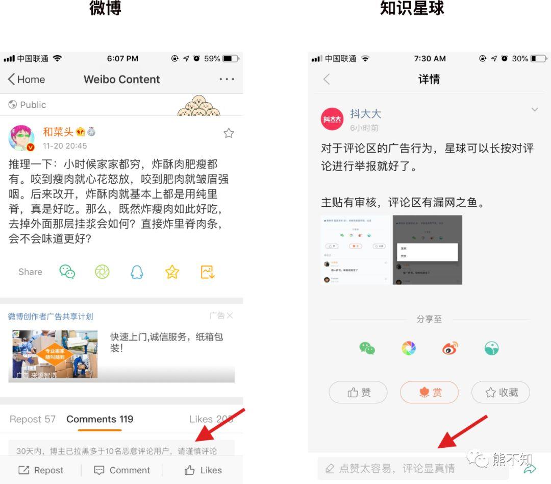
This is because: the stages of development are different, Weibo has a large comment volume, and Knowledge Planet has a small comment volume. The number base is there, so Weibo can prompt careful speaking and improve the quality of comments.
The characteristics of user groups are different. Weibo is a public community with a large number of users. Comments may be their own fans or other channels, such as non-fan users after the topic / hot search. So the motivation and behavior of the reviews are diverse.
Knowledge Planet is a private community. Because of the high recognition of bloggers, we will join such a community, so the values are more similar. So it will only lead the comment and not prompt caution.
In addition, this hint of Weibo is not available to all users. It will be triggered only when some users reach a certain threshold.
Because Weibo users have large numbers and different values, all such protection mechanisms can allow bloggers to see effective comments in good faith and protect the blogger’s mood; on the other hand, they can also Allowing commenters to speak cautiously and preventing them from being blackened also protects the commentator’s mood.
Later optimization
Some apps or websites do not continue to be optimized, so some functions have the same functions and some details will be different compared to the latter. There are various reasons for not continuing to optimize, such as
-
Early development, and subsequent investment in other places, so some functions did not continue to iterate;
-
Or because the previous technical architecture is not easy to change, so I have to leave it alone;
-
Users are used to it, and changing it again will bring new cognitive costs. After the evaluation, the nature was not changed.
The new website, without these concerns, stands on the shoulders of its predecessors and can do better than the previous websites and apps.
Publish button
For example, it is the same content publishing page. Some websites put the publishing button on top, and some put the publishing button to the bottom.
The publishing interface of the WeChat public account is to place the publishing button below the input box;
Jane is placed on the input box.
Which is better?
We can use Fitz’s law to explain. In the input behavior, the WeChat public account release and PMTalk applied Fitz’s law, the release button was placed closest to us, and the target button was set in a different color. , And the button area is larger than the other buttons. This is very convenient for publishing after input.
Fitz’s law is a model of human activity in human-computer interaction and ergonomics. It predicts the time required to quickly move from any position to a target position. The distance between two positions (D) and the target size (S )related.
Product category
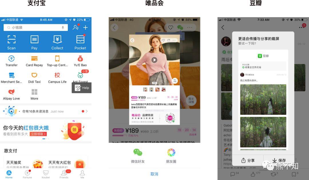
It’s also an operation like screenshot. Due to different product categories, the feedback from the app is also different.
For example, Alipay, after the screenshot, a particularly small floating layer “help” will pop up. After clicking, it will jump to the help page where you can ask for help and feedback.
And Vipshop will generate product pictures to guide the sharing of WeChat friends and circle of friends;
Douban will generate long pictures of social content, which can be downloaded and shared.
This depends on the app category. As a payment product, Alipay may take a screenshot action. It is very likely that a problem has occurred and it is necessary to seek help or provide feedback. For screenshots of product content and social content, we can guess that the user ’s needs may be sharing content.
The screenshot can only capture the portion shown on the current screen. Both Vipshop and Douban have done some processing to make the content more complete and clear. In particular, Douban directly generated the content into long pictures.
What is good user experience? This is to judge your intentions and give you the bests solution. Through this case, we can see that Alipay, Vipshop, and Douban have used different screenshot feedback methods according to the types of their products, giving users an excellent experience.
Product tonality
Different tonality of the product, the design adopted for the same function will also be different, mainly to maintain consistency inside and outside the product.
Navigation bar
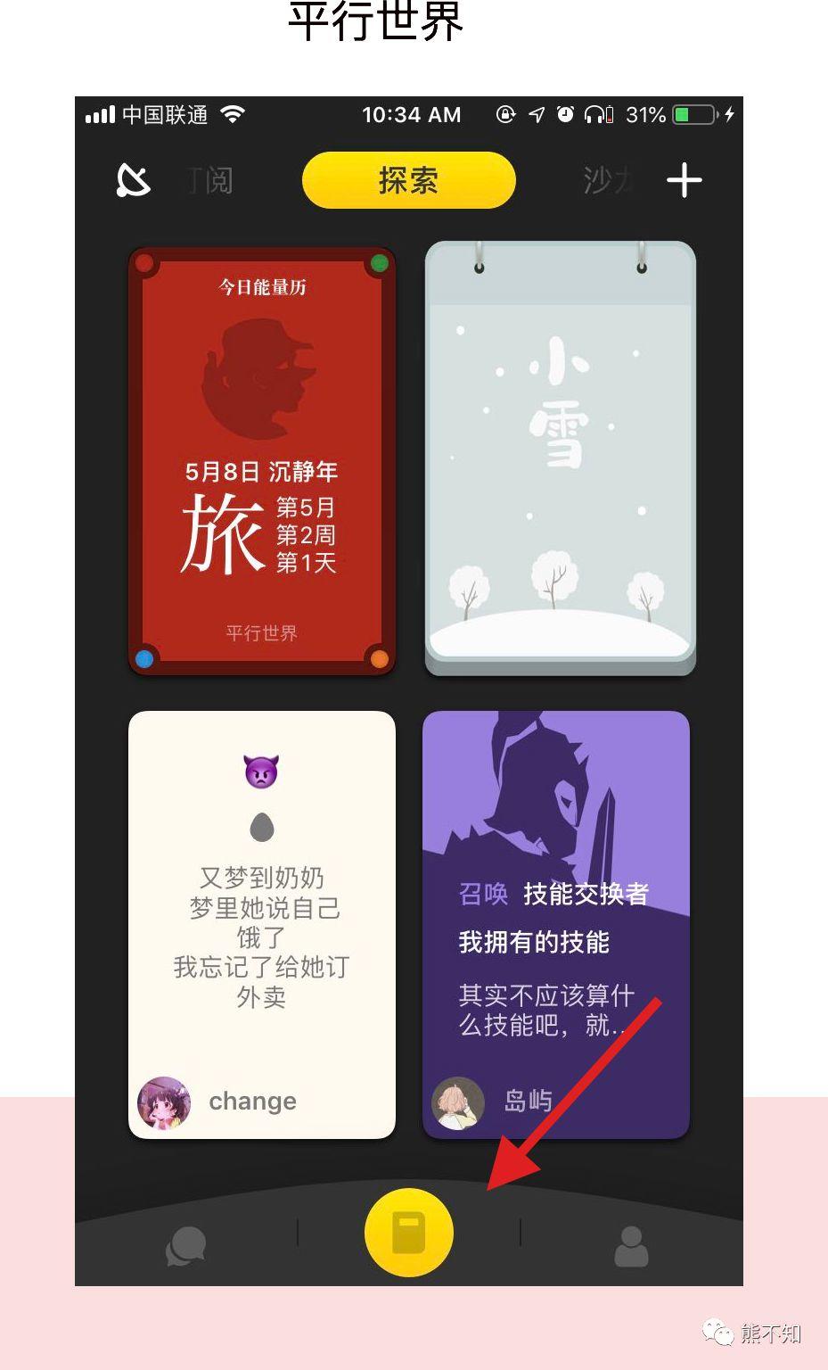
Sometimes the bottom navigation of social categories will be more lively and different. For example, navigation at the bottom of the parallel world.
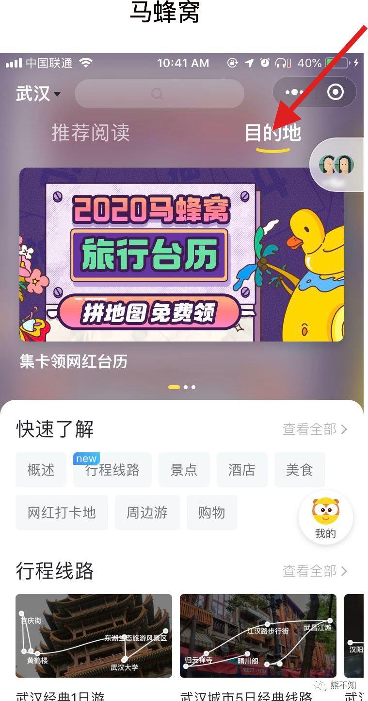
The selected line of the top tab of the travel website Ma Ma Honeycomb is also different from the others. Many apps are normal straight lines. And horse honeycomb is very playful curve.
When we see these two navigation columns, we will not feel obscure, but we will think that this is also very good. It is because their product tonality is well adapted to this or playful or chic style.
If it is like Alipay, if it is a style like this, it is actually a bit inappropriate. Because Alipay first needs to make people feel secure, so the more formal the design, the better.
Loading
Products with different tones have different loading animation designs. For example, the loading animation of station B fits the feeling of the second dimension very cute.
Today ’s headline loading icon is more conventional.
Bold innovation
Sometimes, the design of some functions is already a convention, just see if you have the courage to break the rules. This will bring some risks, such as users will not use it at all; but it will also bring special benefits, which will make users impressed.
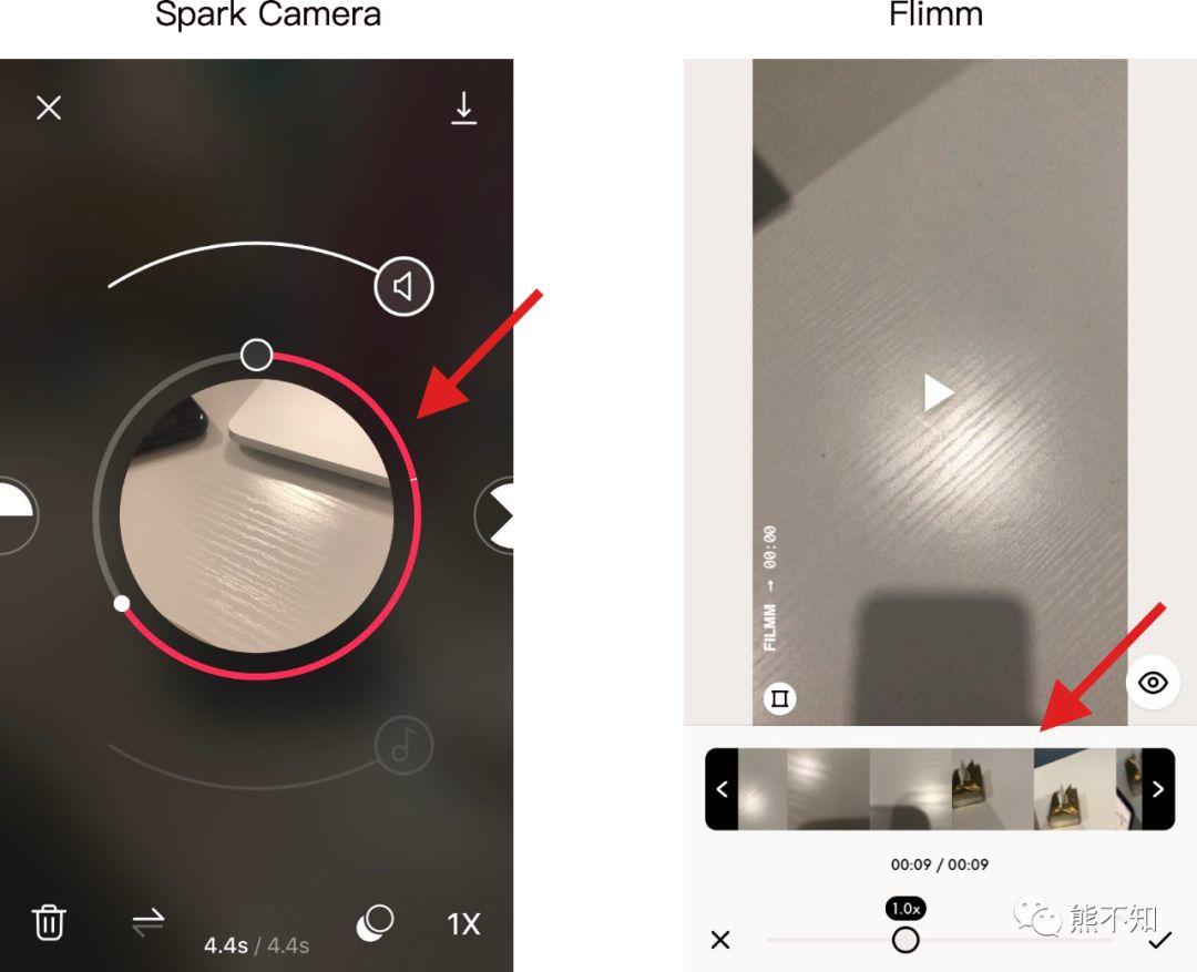
Video editing duration editing function
For example, in the video editing page, we need to edit the length of a video. The most common method is similar to Filmm. Drag the checkbox to the left or right. The advantage of this is that the user has formed a mental model. No need to relearn, you can use it directly.
The Spark Camera, which breaks the ordinary, is to drag the ring on the edge of the video to select the video duration. Although the operation is similar to Filmm, both are dragging, but the layout / position / design is different, which requires the user to restart. Awareness and learning.
However, after the study, it does not affect the operation at all, and also omits the footprint space of the thumbnails, which improves the utilization space of the entire App, making the App look cleaner and more impressive.
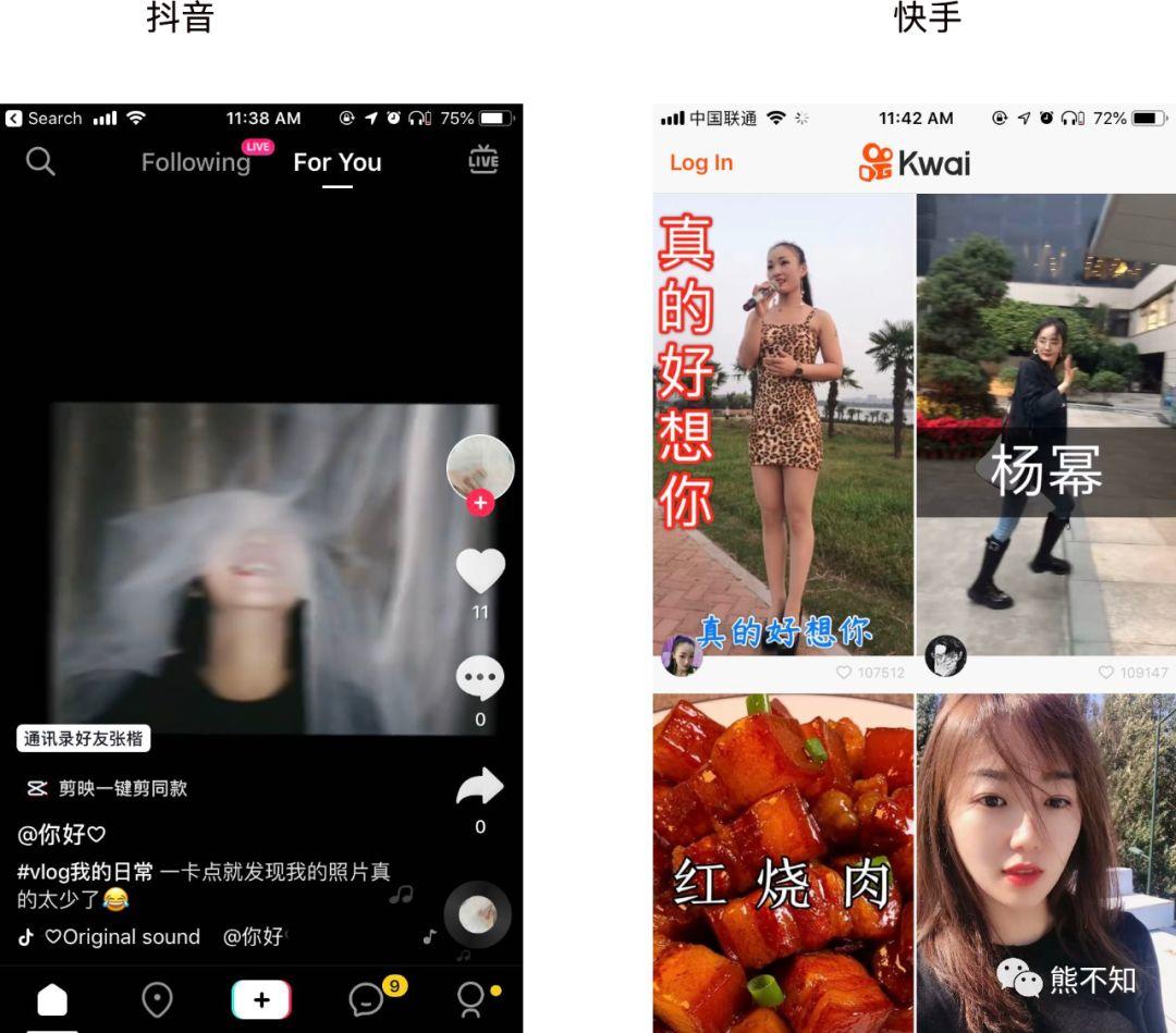
Homepage of small video
Before Douyin appeared, when we thought of making videos, we thought of original old video websites, such as Youku, iQiyi, and Tencent Video. Then when considering making a small video, you will also follow this to make a classification by channel and label. This was the first fast hand to do.
As a result, Douyin proposed a new solution. You don’t need to choose a channel, you can use the full screen method to recommend small videos for you.
So Quick Follower also followed and chose a similar scheme. However, I think this quick solution is not as good as vibrato. Because Douyin is played directly as soon as it enters, there is no hesitation time to let you start consumption directly. The fast hand needs to be chosen. Many times, there are too many choices, but I don’t know what to do, so some users will just log out.
This is Hick’s Law.
Hick’s law is a psychophysical law. The more choices a user faces, the longer it takes to make a choice, and the more options in a human-computer interaction interface, the longer the user takes to make a decision.
Avoid the stigma of pixel-level plagiarism on your back
Sometimes the function is the same, and the optimal interaction way we can think of is the same. Then we need to spend some effort on the UI and some small details to make a difference.
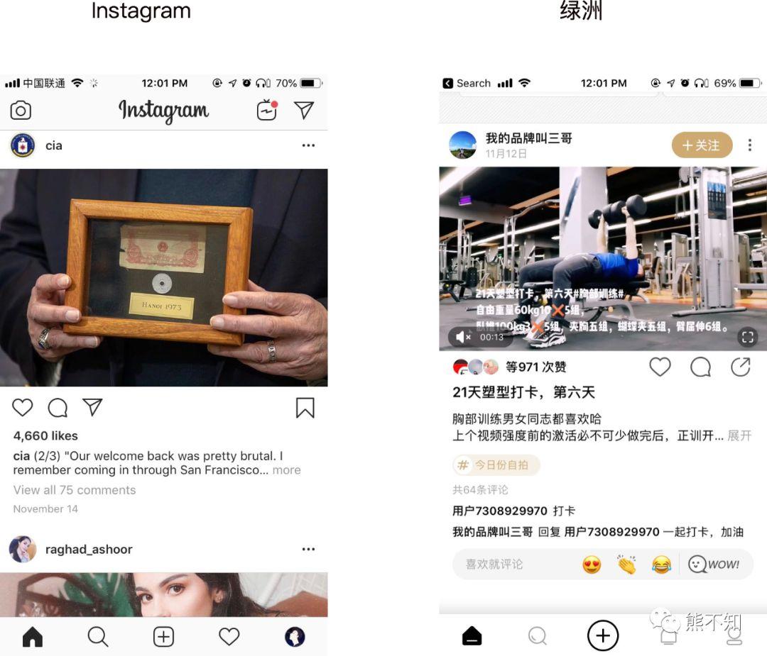
It’s the same as socializing with pictures. Instagram abroad already has very mature interaction schemes. Oasis follows up and the solution is not too bad. But in order to avoid the stigma of pixel-level plagiarism, Oasis will choose some UI styles and small details to adjust, let us see some differences.
Oasis also uses a large map, but some details have changed. For example, the like / comment / share button, the number of likes are made into an avatar, the tag text becomes a conspicuous button, and the comment pop-up box appears after double clicking the like.
Different domestic and foreign environments
Sometimes domestic and foreign users have different habits. So the same product will make a difference. For example, the VIP page, our domestic approach, usually in the process of using the product, there are restrictions, and then guide to jump to the VIP page, guide payment, and the content of the VIP page is also very long, such as Himalayan.
Apps abroad also have this strategy, but many foreign apps also have a different strategy: as soon as they enter the app, a VIP purchase popup box pops up immediately. Take this Video Crop.
Bold strategies seem to be common abroad. Because the willingness of foreign users to pay is high enough, the payment decision path is short enough.
Summary
From the 13 cases above, we can see that even with the same functions, many apps handle them differently.
Some are due to different scenarios and processes, some are due to different product development stages, some are due to different product tones, and some are due to different product goals.
Some products may be exceptionally innovative, so choose to challenge the original design and people ’s habits. Other products simply want to distinguish them from other products to avoid the notoriety of pixel-level plagiarism.
So they made different designs.
When we make products, we cannot avoid using others’ products. (You can see how to use other people’s products decently.) Seeing a variety of products and their different ways of handling the same functions, how do we judge which is good and which is not?
We ca n’t simply judge whether it looks good or not, whether it ’s easy to use or not, but to think more about why they do it and what the benefits are.
At least we can consider these perspectives:
-
Scene
-
Product development stage
-
Product tone
-
Domestic environment
-
Product goals
-
No pixel-level plagiarism
-
Bold innovation
These principles are not only used to judge other people’s products, but can also be used when making product decisions on their own, especially: what are the product goals, the development stage of the product, the user’s use scene, and the tone of the product. Once we understand these things clearly, product decisions will become more decisive and accurate.
Author: Bear I do not know; public number: Bears do not know (ID: xiongbuzhia) chat products every day, concern me, and I found it attractive products.
Cover image from pexels
-