When you slide, it will always understand your intentions and give you the most natural tactile feedback. To create a series of pleasant experiences for users, this may be Apple’s design philosophy.
Editor’s note: This article is from WeChat public account “洋 爷” (ID: yangye365) / a>, author: A Yang, Netease, a senior designer.
Apple is one of the few design-driven companies.
Today, when we talk about product design and user experience, we ca n’t do without Apple. The design philosophy it insists on is the ultimate pursuit of detail and quality. Below, I’ll take you through Apple’s interaction efforts.
Dynamic touch area
In order to solve the problem of inputting this article on mobile devices, Apple has adopted a smooth and user-friendly solution: based on the predictive input system, the effective touch area of the virtual keyboard is enlarged.

The red block is the click area
For example, the words the and this. When you press “th”, the system predicts that the next letter may be e or i, thereby dynamically increasing the click range of these two letters, thereby increasing the hit rate of the input.
Of course, you can’t see the button size change visually. Above your fingertips, everything is invisible.
Sound haptic feedback
In the real world, sound effects, touch, and vision are naturally coordinated because the three have a natural relationship. Apple also strives to maintain this experience in the digital world.
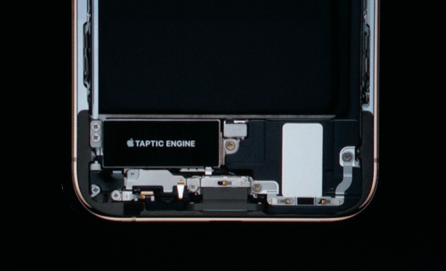
Taptic Engine Linear Vibration Motor
Taptic Engine ’s linear vibration motor gives iPhone tactile feedback.
Flash
iPhoneThe flash on the X lock screen is an example of a very high-level tactile experience. The flashlight icon changes according to the pressure of the finger, letting you know that the system is responding to the operation, and also telling you that you need to work harder.
When the strength is reached, the system will have a short vibration, telling you that you can let go, and there will be a successful vibration feedback after you let go. Does this look like the old-fashioned pull-wire lamp action in the real world?
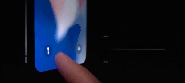
iPhone X lock screen status flash
Alarm clock
In addition, in the alarm clock application, when you adjust the wheel, there will be continuous mechanical vibration feedback, and the sound effect is the sound of the gears of the bicycle chain turning. When you turn the wheel quickly, there will be a physical inertial force until the exhaustion stops.
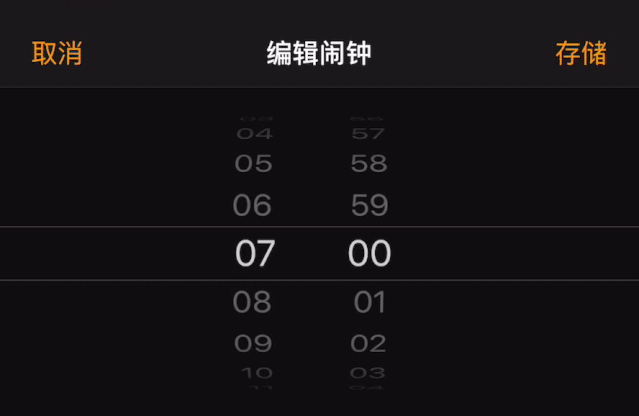
Alarm clock application
So far, the three effects of sound, touch, and vision are integrated, achieving precise synergy.
End point and gesture intention
In a FaceTime video call, there is a small play window in the corner of the screen to represent yourself. This floating small window can be moved to any of the four corners of the screen, these corners are called the end point of the gesture.
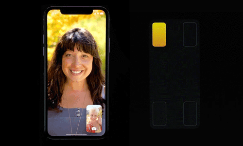
Slide and drag
You can drag the floating window to the corner, but this requires you to cross half the screen, which is very troublesome.
So Apple captures momentum and speed of sliding based on the concept of predicted momentum. The user only needs a lightweight sliding throw to bring the floating window to the predicted position. Apple calls this the end point and gesture intent.
UseClues
How did Apple teach you to use gesture interaction?
In the Safari browser, each tab has an X icon in the upper left corner. When you click the icon, the tab will slide out to the left, indicating that it is closed. This implies that in addition to clicking the icon, you can also use the left swipe to close the tab.
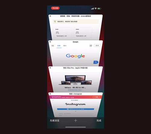
Safari browser
This is one way to teach the other way of operation through behavioral animation clues.
Swipe up to unlock
Physical curve animation
Why does Apple’s transition animation look comfortable?
Because Apple uses a lot of physical properties in the real world: inertia, elasticity, gravity, resistance. Like touch, Apple has placed interactive animation at a very high level.
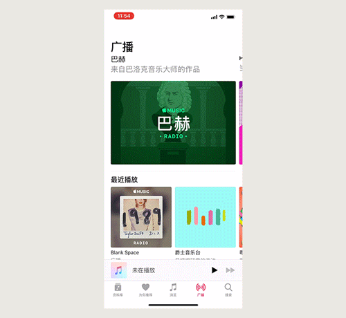
Apple Music
Apple Music’s modal pop-up animation curve design is very rigorous. There is a mini player in the bottom bar of the screen. Click on it to view the playback details. Since there is no momentum for clicking this operation, Apple used 100% damping to ensure it would not overshoot.
But if you pull down to close the modal pop-up window, there is momentum in the downward direction, so Apple used 80% damping to get some elasticity and squeeze. You can see the animation above, and the bottom bar will have a slightly popped effect.
If not necessary, don’t add entities
In 2017, Apple released iPhone X. Face ID replaced Touch ID, establishing a new way to unlock human-computer interaction.
But Liu Hai ’s industrial design has been frantic. Is there any other way? Former Apple Chief Design Officer Jonathan Ivey has commented on Oppo’s lift camera design: “This is a good idea, but we will never do it.” Indeed, do not add entities if not necessary. This is not in line with Apple’s pursuit of simplicity and integrationDesign concept.
Face ID unlocking
Ugly, Face ID still has black technology. There is an infrared camera in the bangs. The industry generally uses a wavelength of 850nm, but this band is easily affected by sunlight. So how did Apple solve it?
It acquired InVisage, a camera sensor company. The company ’s quantum thin-film technology can increase the dynamic range by 3 times, and in one shot, the wavelength of the infrared camera is increased to 940nm. Face recognition.
Redirect
In the use of the device, the user’s operation is always changing, so the intermediate process of interaction also needs to be redirected.
Swipe up and multitasking background
For example, in the process of opening the app, I suddenly realized that I actually want to open the multi-tasking background. At this time, the interactive gestures can be parallel. You do n’t have to wait until the app is fully opened to slide up. Directional.
Even if you have already done so, you can change your intent, easily cancel it, and always keep the interface under the control of the user.
Summary
It always responds in time when you need it. When you slide, it will always understand your intentions and give you the most natural tactile feedback. To create a series of pleasant experiences for users, this may be Apple’s design philosophy.
Cover image from pexels
How did Apple teach you to use gesture interaction?
In the Safari browser, each tab has an X icon in the upper left corner. When you click the icon, the tab will slide out to the left, indicating that it is closed. This implies that in addition to clicking the icon, you can also use the left swipe to close the tab.
Safari browser
This is one way to teach the other way of operation through behavioral animation clues.
Swipe up to unlock
Physical curve animation
Why does Apple’s transition animation look comfortable?
Because Apple uses a lot of physical properties in the real world: inertia, elasticity, gravity, resistance. Like touch, Apple has placed interactive animation at a very high level.
Apple Music
Apple Music’s modal pop-up animation curve design is very rigorous. There is a mini player in the bottom bar of the screen. Click on it to view the playback details. Since there is no momentum for clicking this operation, Apple used 100% damping to ensure it would not overshoot.
But if you pull down to close the modal pop-up window, there is momentum in the downward direction, so Apple used 80% damping to get some elasticity and squeeze. You can see the animation above, and the bottom bar will have a slightly popped effect.
If not necessary, don’t add entities
In 2017, Apple released iPhone X. Face ID replaced Touch ID, establishing a new way to unlock human-computer interaction.
But Liu Hai ’s industrial design has been frantic. Is there any other way? Former Apple Chief Design Officer Jonathan Ivey has commented on Oppo’s lift camera design: “This is a good idea, but we will never do it.” Indeed, do not add entities if not necessary. This is not in line with Apple’s pursuit of simplicity and integrationDesign concept.
Face ID unlocking
Ugly, Face ID still has black technology. There is an infrared camera in the bangs. The industry generally uses a wavelength of 850nm, but this band is easily affected by sunlight. So how did Apple solve it?
It acquired InVisage, a camera sensor company. The company ’s quantum thin-film technology can increase the dynamic range by 3 times, and in one shot, the wavelength of the infrared camera is increased to 940nm. Face recognition.
Redirect
In the use of the device, the user’s operation is always changing, so the intermediate process of interaction also needs to be redirected.
Swipe up and multitasking background
For example, in the process of opening the app, I suddenly realized that I actually want to open the multi-tasking background. At this time, the interactive gestures can be parallel. You do n’t have to wait until the app is fully opened to slide up. Directional.
Even if you have already done so, you can change your intent, easily cancel it, and always keep the interface under the control of the user.
Summary
It always responds in time when you need it. When you slide, it will always understand your intentions and give you the most natural tactile feedback. To create a series of pleasant experiences for users, this may be Apple’s design philosophy.
Cover image from pexels