In Apple’s interface vision, we see various metaphors and hints, we see the smooth experience brought by non-linear animation, and we see the process of sculpting details.
Editor’s note: This article is from WeChat public account “洋 爷” (ID: yangye365) author: a Yang, a senior designer Netease is recommended that you read this article on “Apple’s design Philosophy and Interactions .
App Store changes for ten years
Round corner rectangle
Today’s transition from iOS 7 to flat, Apple has completed the ultimate use of “rounded rectangle”. Apple introduced the concept of continuous curvature in industrial design, which is applied on the outline of rounded icons.
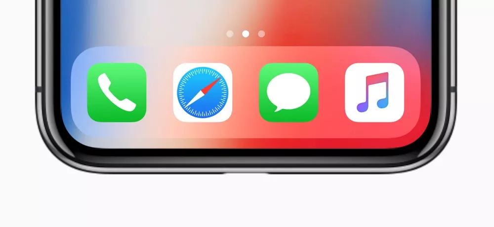
Rounded rectangle
But the real application is reflected in the release of iPhone X. Thanks to the OLED flexible screen and COP package, the iPhone X’s four-sided body has reached the highest design aesthetics. The outer contour of the screen also follows the shape of the body, so there is a rounded Dock.
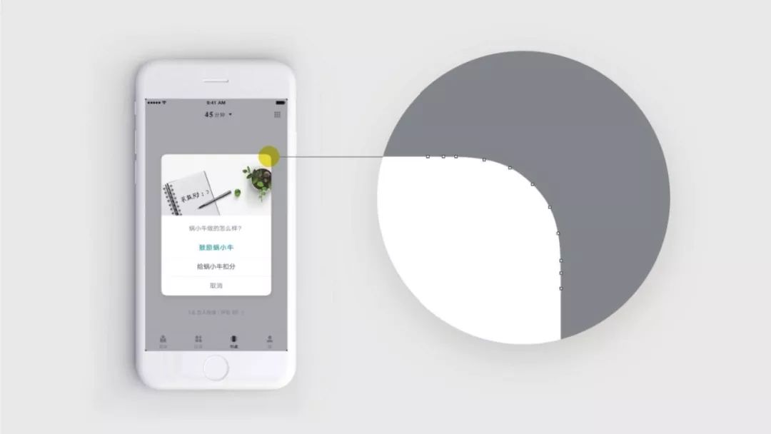
Snail Reading App
In the book “Ingenuity to Design,” the book Snail Reading App is mentioned, which introduces rounded corners in large pop-up windows and cards. Although this is a very detailed design, it is not even perceptible. But it is something that designers are constantly pursuing.
Shadow, translucency, and Gaussian blur
Projection can highlight the importance of content, translucency and Gaussian blur suggest more content behind, while keeping the interface light and transparent.
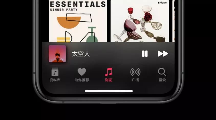
AppleMusic iOS 13 version
Compared to iOS 12, iOS 13 takes the translucent feature one step further. In addition to the mini player, the bottom navigation menu of Apple Music has also become translucent + Gaussian blur.
Taking a closer look, WeChat also agrees with this language, making the top and bottom bars weakly translucent and fuzzy.
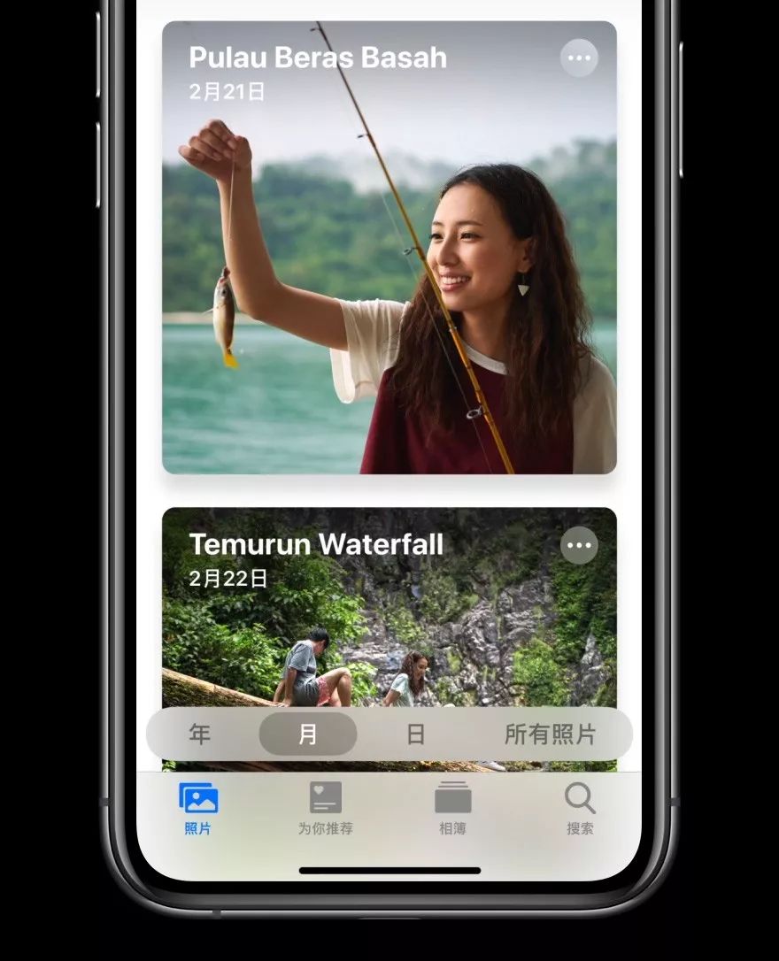
Photo album iOS 13 version
The update of the system album continues the card style of the App Store. At this point, the four characteristics of rounded corners, projection, translucent and Gaussian blur have been confirmed in the album interface.
Extreme icon details
Voice memo
Take voice memo, for example, its track graphics are not drawn randomly. Instead, use the recording function to say the word “Apple”, and the track waveform presented.
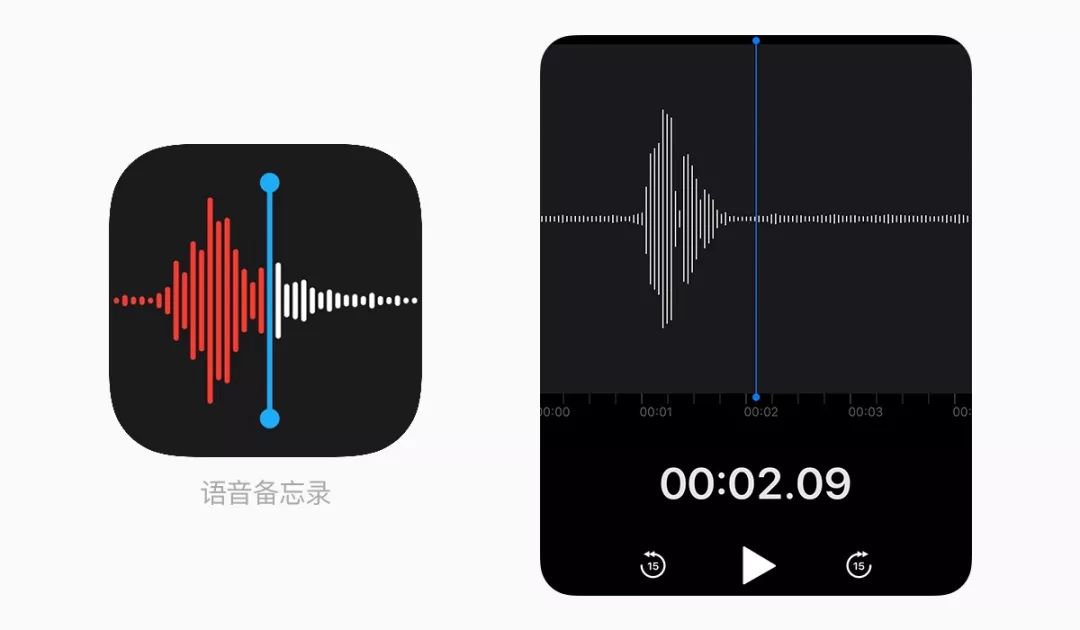
Voice memo & track of Apple words
Also, a small detail is that voice memo is the only built-in application that supports 180 ° vertical screen rotation. Because its common use scenario is interviews, the microphone at the bottom of the phone should be pointed at the interviewee, and the graphical interface is reversed. So support rotation, this is a detailed design based on the user’s use scene.
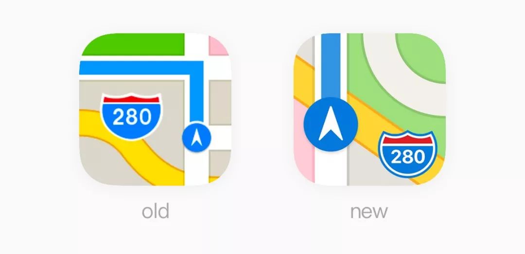
Map
The Apple Map App icon has a subscript “280”, which represents Apple’s headquarters location. One is near Interstate 280 in California.
Apple Maps App
In addition, in the new icon, Apple Park is displayed in the upper right corner, which is the well-known spaceship graphic, which exactly matches the actual flat map.
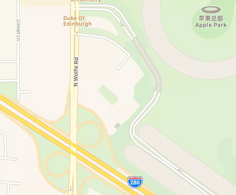
Apple’s new headquarters location
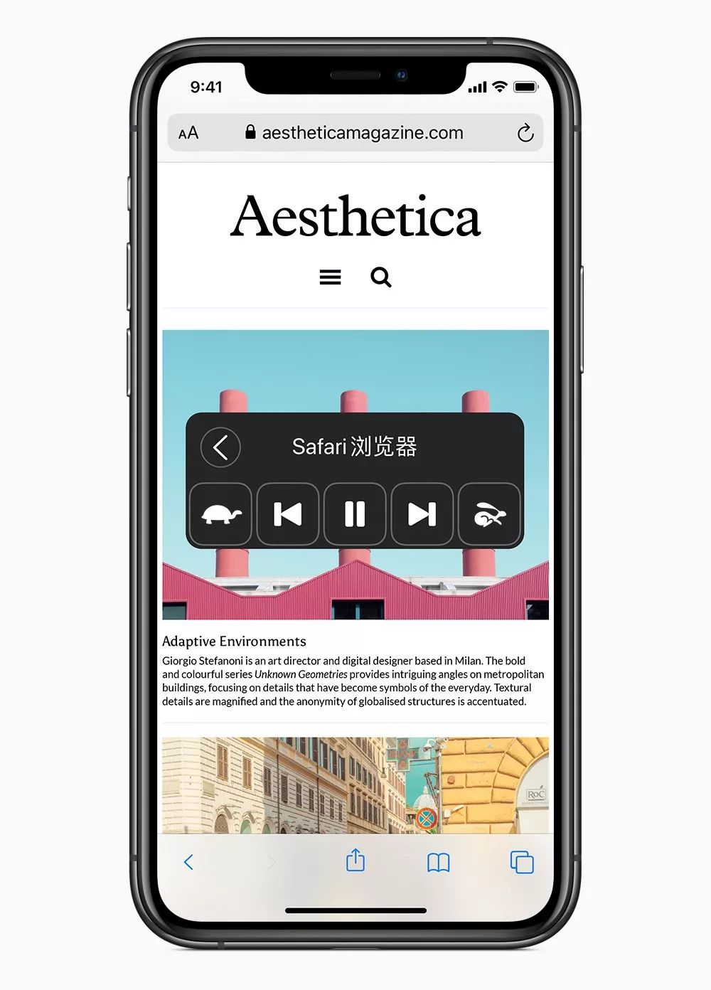
Safari browser
The new Safari icon changes the angle of the magnetic needle from the original 45 ° to 50 °. An interesting explanation is that the geomagnetic north pole has been continuously moving northward, shifting more than 1,000 kilometers in the past 150 years. This statement is obviously more story-telling, but it is not. Because the magnetic pole is north, the angle of the magnetic needle should be smaller and smaller, not larger.
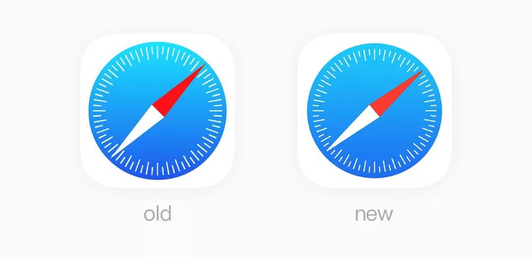
Safari browser
Actually, 45 ° to 50 ° is a visual correction. The old icon on the left. The 45 ° magnetic needle has just covered the short scale bar, which is sandwiched by the two long scale bars. The new icon is just the opposite. The 50 ° magnetic needle is adjacent to the short scale, which has a more visual sense of space and rhythm.
Clock
Everyone knows that the icon time of the Clock App is synchronized with the system time, and the second hand will also rotate uniformly. The point is here. Press and hold the clock app and the movement of the second hand will change from a constant speed to a tick and tick mechanical rotation .
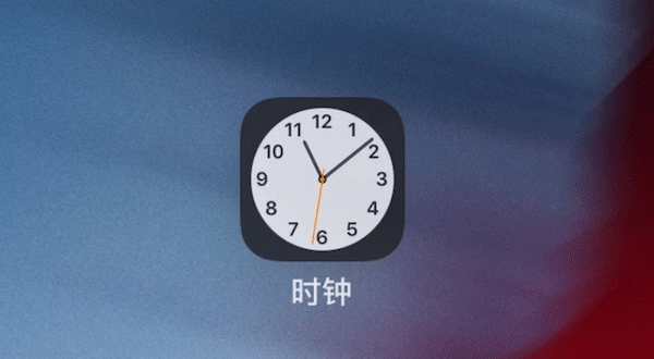
Clock App tick animation
Use visual clues
Why is Apple system easy to use? In the real world, there are some things you know how to use at a glance, such as door handles, MUJI CD players.
Here is a psychological concept: Affordance , a similar mechanism has been established in iOS. With the help of past experience, users can use graphics to anticipate the next action or perceive what it is doing.
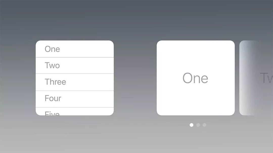
Scrolling content & multi-page content
For example, there is a column of scrolling content on the left. You can crop half of the text at the bottom to let people try to discover that there is more content below. If there are several pages, you can use page pointers to guide the other pages.
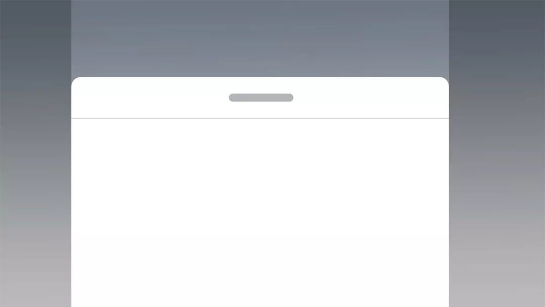
Sliding window
For sliding window content, you can use a handle like this to imply that it can be grabbed and slided.
Metaphors
Good design is communicative. Metaphors (Metaphors) is a good way. It is also one of the six design principles of iOS.
Time metaphor
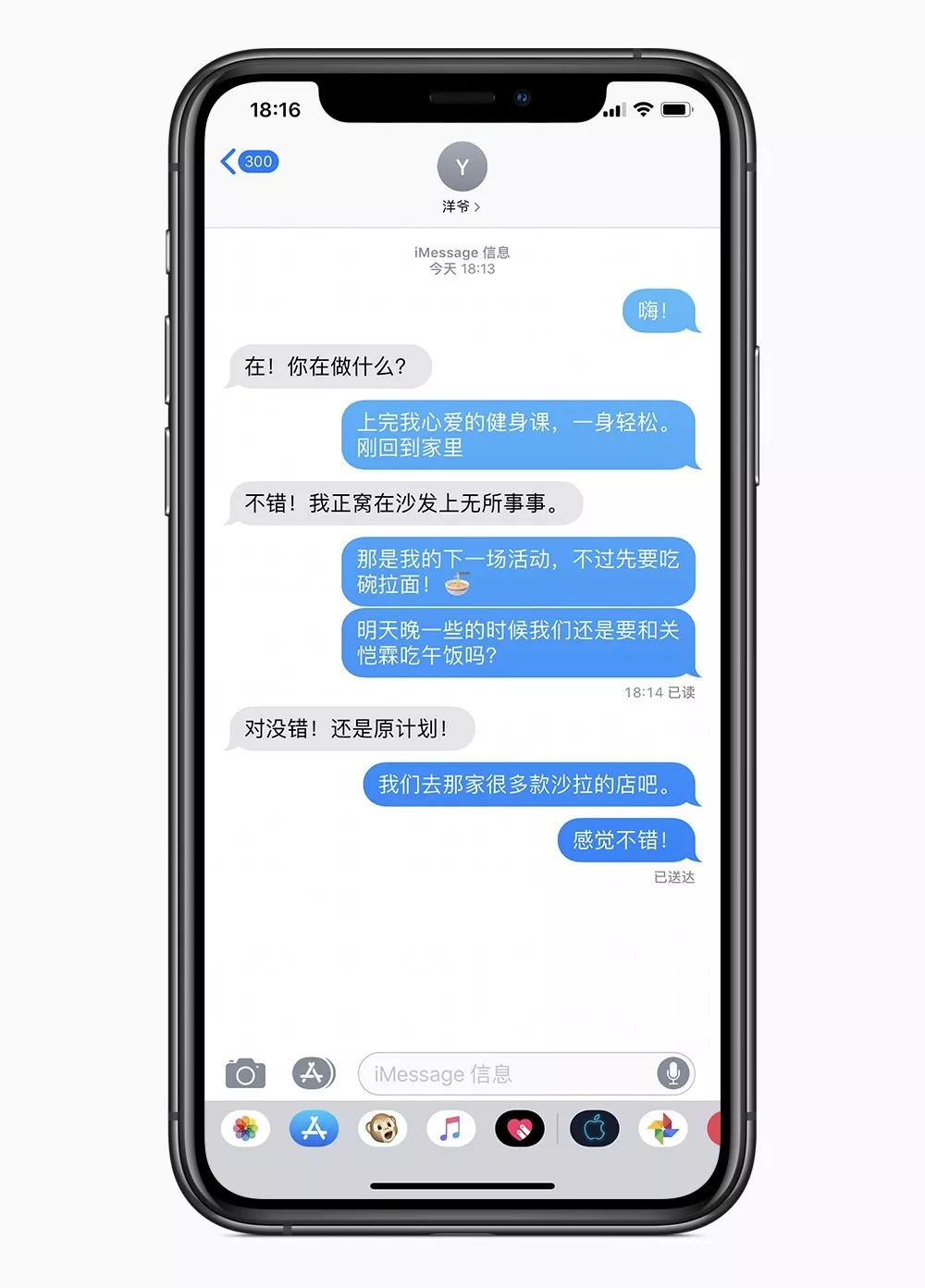
A lot of people think that UI, isn’t it just things like color and spacing? It seems that there is nothing to design. Let’s see how the iOS SMS interface is handled:
-
The background color of the text message bubble changes. The earlier the message, the lighter the color.
-
The two messages are sent in succession. The moments between them are very small, and only the information bubbles below are marked with corners.
-
If the sending interval is a little longer, the upper and lower spacing of the text message will become larger.
SMS interface
Apple has completed the metaphor of time through color gradients and spacing.
Speed metaphor
Apple system has a function of “Reading the screen aloud”. Swipe down with two fingers from the top of the screen to call out. Read out text from documents, web pages, or WeChat on your iPhone or iPad to help you turn reading into reading.
Of course, you can also control the speaking speed of the system. Apple’s icon of the turtle and rabbit race is metaphorically above speed. When the virtual interface of an application is rooted in the familiar real world, users learn faster.
Tortoise and the Rabbit Race
Device synchronization
Apple has many audio product lines, such as Airpods, Airpods Pro, Beats Solo, HomePod, Powerbeats3, each with its own icon. No matter which one you connect, the specific device will be displayed simultaneously.
For example, when your phone is connected to AirPods Pro, the audio speaker icon on the phone interface will become the AirPods Pro icon. In addition, the AirPlay function can connect multiple speakers, even the old and new iPhone icons are distinguished.
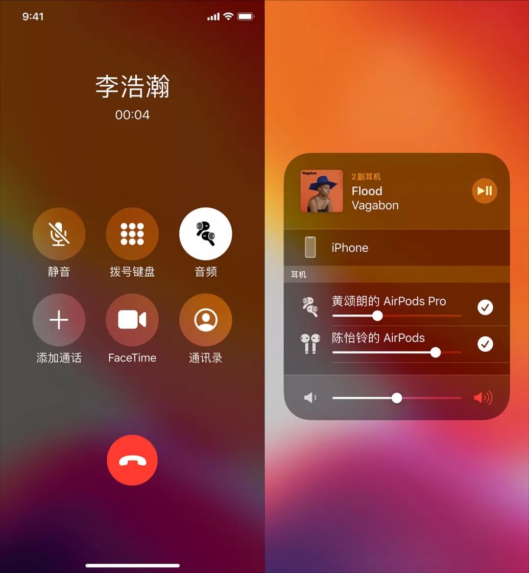
AirPods Pro icon & full screen iPhone icon
Similarly, if you have Powerbeats3 headphones and the system is the latest iOS 13. When you adjust the volume, the speaker icon will also change to the Powerbeats3 headset icon.
Powerbeats3 icon
San Francisco font secrets
San Francisco fonts are now standard on the Apple platform: they are used on Apple Watch, iPhone, iPad, and Mac, replacing the previous Helvetica Neue.
Central alignment optimization for colons
The new font has some subtle changes. What impressed me most was the way the colon “:” was displayed. Under normal circumstances, the colon is on the baseline, and the visual perception will be lower. But if the colon is placed in the middle of the number, the system will align it vertically centered.
Symbol optimization
In addition, the opening in the middle of the “#” symbol is a non-parallel cut, which is intentionally enlarged. Because when the size of # is reduced to a certain extent, the cut will be difficult to recognize. So more white space is needed visually to improve readability.
Non-linear animation
An important performance indicator for user experience is: Speed Index . With the continuous improvement of hardware devices, it is undeniable that Android now starts faster than iOS. However, Apple has added a lot of non-linear animations and stable frame rate performance, and iOS is better at fluency.
iOS 13 dark mode switching animation
Explaining non-linear animation is that it starts quickly and slowly slows down at the end. For example, the animation of the process of opening any app, the moment when the keyboard is pulled up, and the fast switching of the dark mode of the iOS 13 Control Center, this icon animation also uses non-linearity.
iOS 13 mute switch animation
The volume and mute adjustments, which have been criticized, have finally been resolved. The original big Toast hint will block the current content, but now it is changed to the top display, and a physical attenuation bell animation is added, which is very realistic.
Summary
In Apple ’s interface vision, we see various metaphors and hints, we see the smooth experience brought by non-linear animation, and we see the process of sculpting details. It is something that designers are constantly pursuing, and ultimately presents users with an extra courteous product experience.
By theway, if you like my article, remember to like and repost! In addition, you feel that Apple has other well-done details, and welcome to comment below.
Cover image from pexels
Why is Apple system easy to use? In the real world, there are some things you know how to use at a glance, such as door handles, MUJI CD players.
Here is a psychological concept: Affordance , a similar mechanism has been established in iOS. With the help of past experience, users can use graphics to anticipate the next action or perceive what it is doing.
Scrolling content & multi-page content
For example, there is a column of scrolling content on the left. You can crop half of the text at the bottom to let people try to discover that there is more content below. If there are several pages, you can use page pointers to guide the other pages.
Sliding window
For sliding window content, you can use a handle like this to imply that it can be grabbed and slided.
Metaphors
Good design is communicative. Metaphors (Metaphors) is a good way. It is also one of the six design principles of iOS.
Time metaphor
A lot of people think that UI, isn’t it just things like color and spacing? It seems that there is nothing to design. Let’s see how the iOS SMS interface is handled:
-
The background color of the text message bubble changes. The earlier the message, the lighter the color.
-
The two messages are sent in succession. The moments between them are very small, and only the information bubbles below are marked with corners.
-
If the sending interval is a little longer, the upper and lower spacing of the text message will become larger.
SMS interface
Apple has completed the metaphor of time through color gradients and spacing.
Speed metaphor
Apple system has a function of “Reading the screen aloud”. Swipe down with two fingers from the top of the screen to call out. Read out text from documents, web pages, or WeChat on your iPhone or iPad to help you turn reading into reading.
Of course, you can also control the speaking speed of the system. Apple’s icon of the turtle and rabbit race is metaphorically above speed. When the virtual interface of an application is rooted in the familiar real world, users learn faster.
Tortoise and the Rabbit Race
Device synchronization
Apple has many audio product lines, such as Airpods, Airpods Pro, Beats Solo, HomePod, Powerbeats3, each with its own icon. No matter which one you connect, the specific device will be displayed simultaneously.
For example, when your phone is connected to AirPods Pro, the audio speaker icon on the phone interface will become the AirPods Pro icon. In addition, the AirPlay function can connect multiple speakers, even the old and new iPhone icons are distinguished.
AirPods Pro icon & full screen iPhone icon
Similarly, if you have Powerbeats3 headphones and the system is the latest iOS 13. When you adjust the volume, the speaker icon will also change to the Powerbeats3 headset icon.
Powerbeats3 icon
San Francisco font secrets
San Francisco fonts are now standard on the Apple platform: they are used on Apple Watch, iPhone, iPad, and Mac, replacing the previous Helvetica Neue.
Central alignment optimization for colons
The new font has some subtle changes. What impressed me most was the way the colon “:” was displayed. Under normal circumstances, the colon is on the baseline, and the visual perception will be lower. But if the colon is placed in the middle of the number, the system will align it vertically centered.
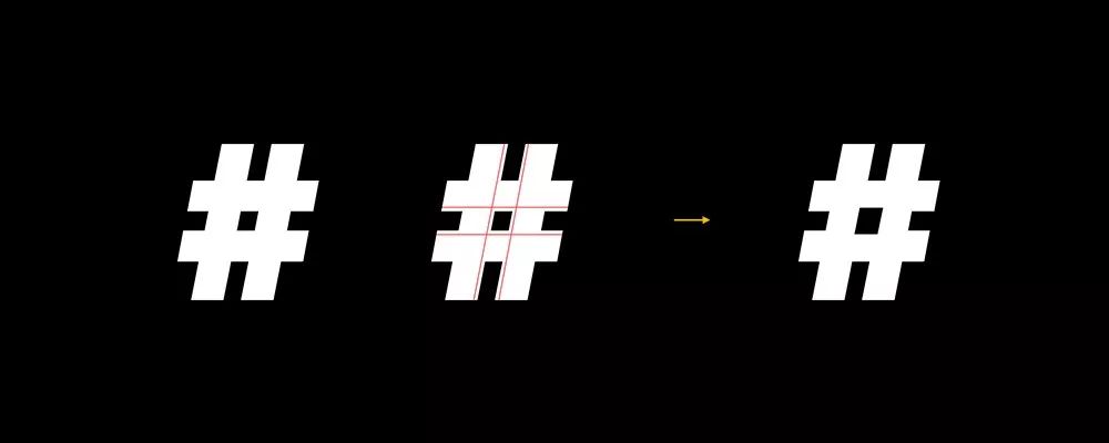
Symbol optimization
In addition, the opening in the middle of the “#” symbol is a non-parallel cut, which is intentionally enlarged. Because when the size of # is reduced to a certain extent, the cut will be difficult to recognize. So more white space is needed visually to improve readability.
Non-linear animation
An important performance indicator for user experience is: Speed Index . With the continuous improvement of hardware devices, it is undeniable that Android now starts faster than iOS. However, Apple has added a lot of non-linear animations and stable frame rate performance, and iOS is better at fluency.
iOS 13 dark mode switching animation
Explaining non-linear animation is that it starts quickly and slowly slows down at the end. For example, the animation of the process of opening any app, the moment when the keyboard is pulled up, and the fast switching of the dark mode of the iOS 13 Control Center, this icon animation also uses non-linearity.
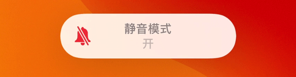
iOS 13 mute switch animation
The volume and mute adjustments, which have been criticized, have finally been resolved. The original big Toast hint will block the current content, but now it is changed to the top display, and a physical attenuation bell animation is added, which is very realistic.
Summary
In Apple ’s interface vision, we see various metaphors and hints, we see the smooth experience brought by non-linear animation, and we see the process of sculpting details. It is something that designers are constantly pursuing, and ultimately presents users with an extra courteous product experience.
By theway, if you like my article, remember to like and repost! In addition, you feel that Apple has other well-done details, and welcome to comment below.
Cover image from pexels
-
The background color of the text message bubble changes. The earlier the message, the lighter the color.
-
The two messages are sent in succession. The moments between them are very small, and only the information bubbles below are marked with corners.
-
If the sending interval is a little longer, the upper and lower spacing of the text message will become larger.
SMS interface
Apple has completed the metaphor of time through color gradients and spacing.
Speed metaphor
Apple system has a function of “Reading the screen aloud”. Swipe down with two fingers from the top of the screen to call out. Read out text from documents, web pages, or WeChat on your iPhone or iPad to help you turn reading into reading.
Of course, you can also control the speaking speed of the system. Apple’s icon of the turtle and rabbit race is metaphorically above speed. When the virtual interface of an application is rooted in the familiar real world, users learn faster.
Tortoise and the Rabbit Race
Device synchronization
Apple has many audio product lines, such as Airpods, Airpods Pro, Beats Solo, HomePod, Powerbeats3, each with its own icon. No matter which one you connect, the specific device will be displayed simultaneously.
For example, when your phone is connected to AirPods Pro, the audio speaker icon on the phone interface will become the AirPods Pro icon. In addition, the AirPlay function can connect multiple speakers, even the old and new iPhone icons are distinguished.
AirPods Pro icon & full screen iPhone icon
Similarly, if you have Powerbeats3 headphones and the system is the latest iOS 13. When you adjust the volume, the speaker icon will also change to the Powerbeats3 headset icon.
Powerbeats3 icon
San Francisco font secrets
San Francisco fonts are now standard on the Apple platform: they are used on Apple Watch, iPhone, iPad, and Mac, replacing the previous Helvetica Neue.
Central alignment optimization for colons
The new font has some subtle changes. What impressed me most was the way the colon “:” was displayed. Under normal circumstances, the colon is on the baseline, and the visual perception will be lower. But if the colon is placed in the middle of the number, the system will align it vertically centered.
Symbol optimization
In addition, the opening in the middle of the “#” symbol is a non-parallel cut, which is intentionally enlarged. Because when the size of # is reduced to a certain extent, the cut will be difficult to recognize. So more white space is needed visually to improve readability.
Non-linear animation
An important performance indicator for user experience is: Speed Index . With the continuous improvement of hardware devices, it is undeniable that Android now starts faster than iOS. However, Apple has added a lot of non-linear animations and stable frame rate performance, and iOS is better at fluency.
iOS 13 dark mode switching animation
Explaining non-linear animation is that it starts quickly and slowly slows down at the end. For example, the animation of the process of opening any app, the moment when the keyboard is pulled up, and the fast switching of the dark mode of the iOS 13 Control Center, this icon animation also uses non-linearity.
iOS 13 mute switch animation
The volume and mute adjustments, which have been criticized, have finally been resolved. The original big Toast hint will block the current content, but now it is changed to the top display, and a physical attenuation bell animation is added, which is very realistic.
Summary
In Apple ’s interface vision, we see various metaphors and hints, we see the smooth experience brought by non-linear animation, and we see the process of sculpting details. It is something that designers are constantly pursuing, and ultimately presents users with an extra courteous product experience.
By theway, if you like my article, remember to like and repost! In addition, you feel that Apple has other well-done details, and welcome to comment below.
Cover image from pexels