The data will also be deceiving > author: Yong homes.
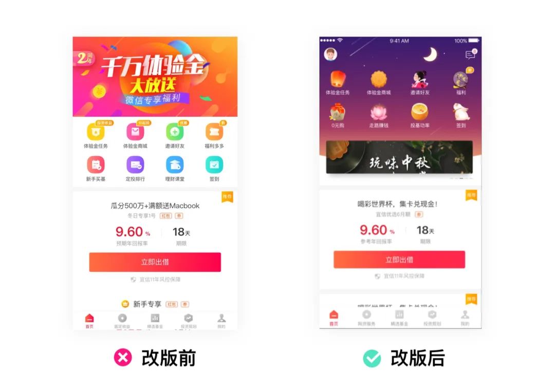
Let me tell a story about data exploration in my previous work: once before the National Day, our team did a revision of the first screen. At first, the product team was not very supportive of this solution, and worried about the regular version. Because the position of banne moves below the icon to affect the operation data. During the week when I first went online, banner data dropped very badly. Soon, we launched the ab version test of the skin atmosphere immediately before the National Day, and the skin version data was exceptionally good. Therefore, we used this data to make a strong proof of the design. Later, this skin plan became a weapon for operating activities, and large-scale events and holidays were used.
Afterwards, I have been reflecting on the relationship between the original design and the data: Is the design affecting the data? Or did the National Day holiday affect the data, and what behavioral changes resulted from the banne traffic data?
Next, let me talk about my new understanding of data.
Some good looking vanity data
What is vanity data? In fact, it is the data that looks good but does not bring any value to this product. Such as clicks, downloads, number of users, stay time. Let’s see how this data is not generating value.
(1) Clicks. Refers to the number of clicks on a resource bit in a certain period of time. Of course, it does n’t make sense to talk about clicks alone. For example, if a user continuously clicks on some resource bits, or clicks change due to some profitable activity subsidies, which one of these statistics can represent?
(2) The number of users. Counting the number of users is just a meaningless and popular game, unless it allows users to do things that are good for the product. For example, how many users can convert purchases when launching an event? Only by knowing this number can the number of users be valuable.

(3) Dwell time. Using dwell time data to count user engagement or activity, he doesn’t explain anything. For example, customers stay on a page full of text content for a long time and may not see any value.
(4) Downloads. Although it sometimes affects your ranking in the app store, the download volume itself does not bring value; you also need to refer to: the user’s activation amount after downloading, account creation amount, and so on.
Actionable indicators
Actable data means that we can discover the problem through the disclosure of the data, so as to improve the design plan and decide the next action.
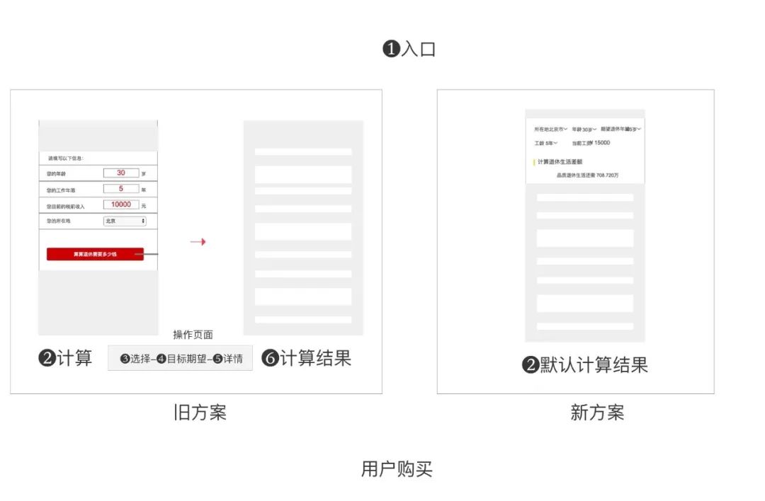
(1) Conversion rate = conversions / visits. The conversion rate can be used to measure the effectiveness of the product. For example, a certain resource bit can bring 100 user visits per day, but only one conversion. Under this data, some program improvements have been made and it is found that it can bring 100 user visits per day. To 50 conversions. This shows that the improvement of the design scheme improves the higher conversion rate and higher. For example, we found that the user conversion rate is low in the pension calculator. By pre-calculating the calculation results, it affects the user’s purchase decision and improves the conversion rate to a certain extent.
(2) Bounce rate: Bounce rate is an indicator of traffic quality. After the user enters the app, they only visit one page and then leave. The percentage of user visits to the total visits is the lower the bounce rate. The lower the bounce rate, the better the traffic quality, and the more interested the user is in the product content.
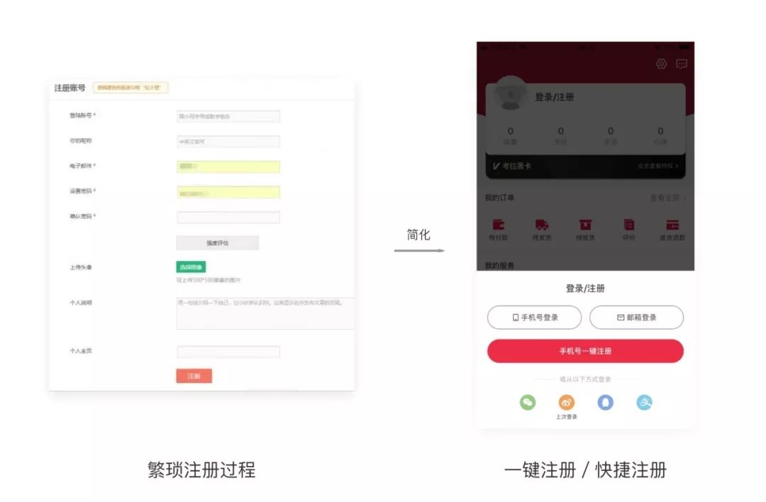
For example: We found that the user’s operation path is too long through the funnel data. We reduced the path of several steps to one operation, and finally saw that the user bounce rate decreased.
How to use the value of data rationally?
(1) Human factors
The data itself does not deceive people, it is where it really exists, but some people are selective for their own interestsShow some data, use the data for your own use.
For example: I mentioned at the beginning that the click-through rate data brought by the skin is actually useless vanity data, just using the data to support the design plan. But the real data behind it still need to dig deeper.
So some data are not necessarily conclusive facts, it depends on the user’s starting point and purpose.
(2) Quantitative and qualitative data
Quantitative data refers to those measurable numbers that are scientific, such as ratings and rankings. Qualitative data is imprecise, subjective, and difficult to quantify. If quantitative data answers questions like “what” and “how much”, qualitative data answers “why”.
For example:
Qualitative data: users like golden yellow data has improved significantly
Quantitative data: The golden revision brings a 50% increase in data
(3) Reference of data
If it is meaningless to look at the data from one side, you need to refer to other data to find the relationship between the data. For example, if two data always change together, it means that they are related. If one of the data causes a change in the other, there is a causal relationship between them.
For example: the number of product registrations has increased due to changes in distribution channel data. This is relevant, and the channel affects the registration data.
(4) Observation based on experience
For example, in the summer, “ice cream sales” and “drowning deaths” are directly proportional, and the trends between the two are highly consistent.
When you see this information, a simple analysis of data will understand that ice cream sales have increased the number of drowning deaths. However, if you use common sense to reason, you will know that the two data are not related at all. The only thing in common is that “summer weather is hot.” Therefore, the sales of ice cream will rise, and the number of people swimming in the water will increase. Number of drowning. We can see that the data is objective and rational, but people have observations and experience. We need to use experience observation to judge the objectivity of the data to avoid going into the data’s misunderstanding.
(5) Deep mining
When Baidu conducted a questionnaire survey on users, it was found that a large number of data users were unwilling to show history. Judging from the data alone, these users can design the feature of removing history records by closing the history records. However, after conducting in-depth investigations of users, it was found that users were mindful of some obscure words they searched for. In this way, the improvement of this program is that the user can choose to clear the history.
(6) a / b data test
For example, the result of a design test is to help optimize the product experience and business value conversion. Changes in the data results of these a / b tests can affect the designerThe result of the case, for example, if the app function is made into some a or b version, compare which version can bring more conversions. A good data indicator can change business behavior because its ultimate goal is to reflect the value: effectively acquire users and generate revenue.
Summary:
We recognize that data is rational. It exists objectively, but also has its limitations. Data is just a tool and method we use to summarize and improve user experience products. Practice is the truth. We want a deeper interpretation. The value behind data must be explored and practiced by yourself.
About the author
Hellen, invited author, everyone is a product manager columnist, and today is a high-quality creator in the headline technology field.