NASA, a “design agency” that has been “delayed” by the aerospace industry, has announced that it has retired to NASA’s red “worm” logo for 28 years.
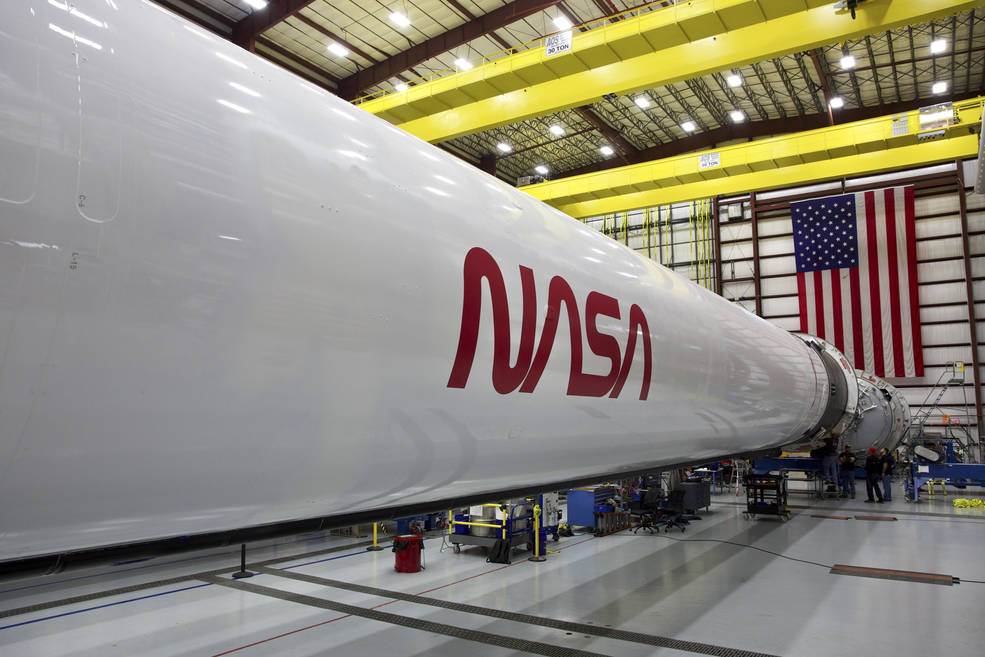
The SpaceX Falcon 9 rocket with the “Worm” logo will launch a manned dragon spacecraft in May to send NASA astronauts to the International Space Station to complete the manned dragon spacecraft The first commercial manned test flight.
This is a fight between “worms” and “meatballs”. Before re-enabling the “worm” logo, NASA’s official logo was the blue “meatball”, because the “worm” was designed because it was too difficult to print. After 17 years of symbiosis, the “worm” was replaced by the then NASA director Daniel S. Goldin.
But the current NASA director Jim Bridenstine said that he has always been a bit of a worm. But this time NASA said that “meatballs” will remain NASA’s main symbol.
“Meatball” is too difficult to print
“Meatball” is too difficult to print
The history of the “Meatball” logo can be traced back to 1959. At that time, the National Aeronautical Advisory Committee (NACA) transformed into an organization that could simultaneously advance the aviation and aerospace cause: the National Aeronautics and Space Administration (NASA).
After the design of the illustrator of NASA Lewis Research Center (now renamed Glen Research Center) was selected as the official logo of the new institution, NACA also commissioned the Lewis Research Center to study The head of the reporting department, James Modarelli, designed a logo for NASA that can be used for less formal occasions.
 designed by James Modarelli in 1959 The “Meatball” logo
designed by James Modarelli in 1959 The “Meatball” logo
In 1959, the second year of NASA ’s establishment, a new design took shape. The simplified logo leaves only the names of stars, orbits, wings, planets and institutions. The round logo composed of red, white and blue is nicknamed “Meatball”. The circular pattern represents a planet, the stars represent space, the red V-shaped wings represent aeronautics, and the circular orbit around the institution name represents space travel.
“Meatball” is the most common logo of NASA in 16 years, and is known by NASA as one of the most powerful logos in the world. However, it still has a lot of complex elements, and it is difficult to print with the technology of the 1970s.
In 1972, the National Endowment for The Arts launched the Federal Design Improvement Program to improve the visual standards of government agencies. The NASA logo is in a state of need for reform. The chairman of the foundation, Nancy Hanks, named NASA to be the main target of this plan.
 NASA ’s” worm “logo from 1975 to 1992
NASA ’s” worm “logo from 1975 to 1992
A more “modern” logo was born. In 1975, the designers of Danne & Blackburn in New York, Richard Danne and Bruce Blackburn, designed the “worm” logo. The smooth red “worm” was simplified from the word “NASA”, changing the previous realistic and even fancy style. Due to the simplicity and innovation of the design, in 1984, “Worm” wonThe praise of President Root was also honored by the President.
“The new logo is very pleasing to the eye, and gives people a kind of unity, technical precision, and thrust and direction for the future. Unity, technology, pioneering achievements, this is NASA All of it. “Richard H. Truly, then NASA’s director, wrote in NASA’s visual design standards manual.
Current NASA Director: I have always been a bit biased towards “worms”
Current NASA Director: I have always been a bit biased towards “worms”
“Meatballs” have not disappeared because of the appearance of “worms”, both Symbiosis for 17 years.
Just in 1992, this minimalist logo from the 1970s was “retired” and replaced by the original pattern from the late 50s.
At that time, NASA Administrator Daniel S. Goldin believed that the best way to inspire people ’s interest in the future was to revisit NASA ’s exciting past, so he switched back to “ “Meatball” as the official logo.
 NASA ’s logo for official agency activities
NASA ’s logo for official agency activities
This “bug” has not been forgotten, especially in the United States Generation X (that is, the generation born in the early 1960s to the mid-70s), including the current NASA Director Jim Bridenstine.
Born in 1975, Jim Bridenstine often said that he was the first director born after the end of the Apollo program. “I grew up in the 1980s.” He once said, “In the 1980s, ‘worm’ was a symbol of NASA, and I have always preferred it a little bit.”
2011 Years, beautifulAfter the National Space Shuttle was retired, all US tools for transporting astronauts to and from the space station “relied on” Russian spacecraft. But when SpaceX is about to make its first commercial flight test of the manned Dragon spacecraft, Jim Bridenstine feels, “Bringing back the” worm “as an inspiration to the country will be a proper tribute to that moment.”
To this day, the “worm” logo is finally back. NASA believes that this just marks the return of human space flight in the United States. NASA is still evaluating how and where to use this “bug”, but Jim Bridenstine said that the “worm” logo will play a broader role in NASA.
He thought that maybe the future “Starliner” developed by Boeing to the International Space Station will also carry the “worm” logo, although they “have not left yet To that step “.
It seems that this “worm” has not really retired, it is just a temporary break for space exploration in the next chapter. But don’t worry, this time NASA said, “Meatball” will still be NASA’s main symbol.