And why should we develop a set of “design philosophy”.
Editor’s note: This article is from the micro-channel public number “Hang Newswire” (ID: lifeissohappy), Author: Book Air.
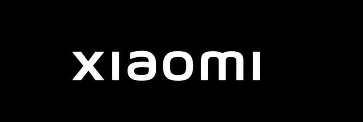
The Xiaomi Group announced the first major logo upgrade in 10 years. The new standard was personally executed by Kenya Hara, chairman of NDC and professor at Musashino Art University. It took 3 years to complete the draft and spent 2 million yuan.
(According to @Internet, the design fee is not 2 million, but 6.5 million; however, the original statement is still used at the time of writing.)
The new standard uses a “super-ellipse” contour design to replace the original square contour, redesigns the “xiaomi” letter logo, sets orange, black and silver as the brand color system, stipulates the specific scenes of the logo, and designs The dynamic logo for the screen also comes with a canvas bag.
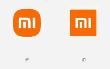
However, from the perspective of netizens, this time the change of the standard is just to replace the original orange square with the “mi” letter with a rounded rectangle. The most common comment from netizens is that “Mr Lei was cheated of money.”
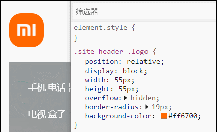
Even, some people found that Xiaomi’s official website only manually added a line of code to the style of the homepage logo after the change of the logo, so that it changed from a square to a rounded corner, which can be described as “fooling” with full marks.
Of course, a complete brand identity system (VI) design cannot be “cheating money”, but ordinary people always feel that the logo must be completely changed to a new look to be worthy of this price. Just fine-tuning is not counted. It is not enough to replace it with a new one, and it is necessary not to crash the car with other similar signs; it is not enough to be unique, and it has to be attractive, beautiful, novel, amazing and so on from the perspective of ordinary people.
There are specific examples of these mentioned by the president. The VI update that is just fine-tuned is “cheating moneyThe sign says “xiaomi 11”.
This is completely different from what Lei Jun said when he first founded Xiaomi-he explained at the time that “mi” is the abbreviation of “mobile internet”. Ten years later, “xiaomi” uses Pinyin back, and doesn’t care that foreigners don’t know how to pronounce “shiao-mee”. To a certain extent, it also means that Chinese brands have gained a firm foothold.
——Let’s talk about BCI for cotton, Chinese members are all upstream in the supply chain, while the downstream make a lot of money are European and American brands. So what industry is close to the consumer side, and can most of it be Chinese brands? Cell phone! Therefore, the establishment of an industry alliance that holds certain values for Chinese mobile phones, the president feels that it is also completely feasible…
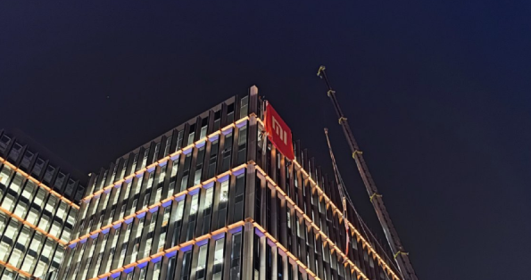
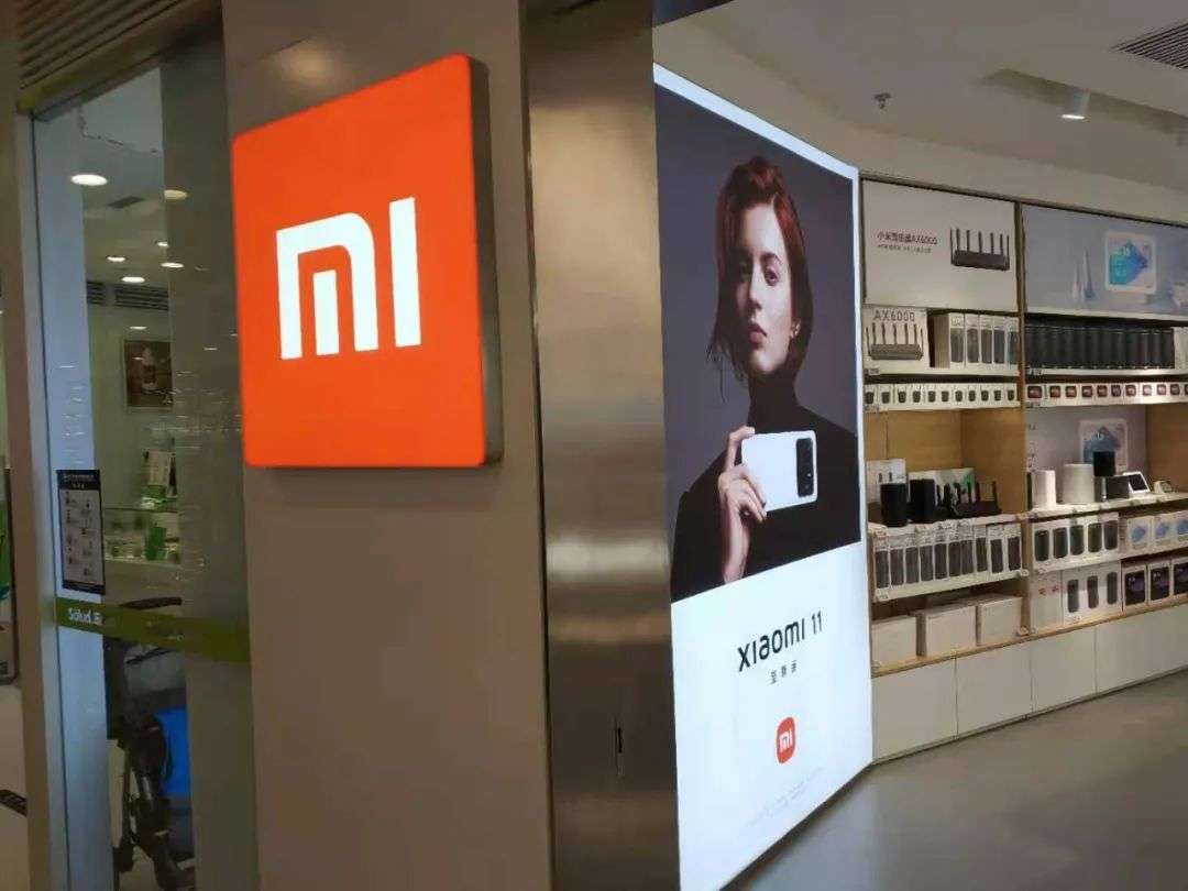
Another change is the extended use of the Xiaomi logo. From the renderings, you can see the design of the signboard of the Mi Home store, which highlights the size of the logo, so that it breaks through the long white frame behind the sign.
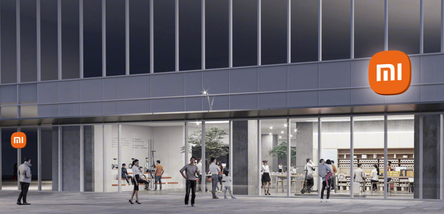
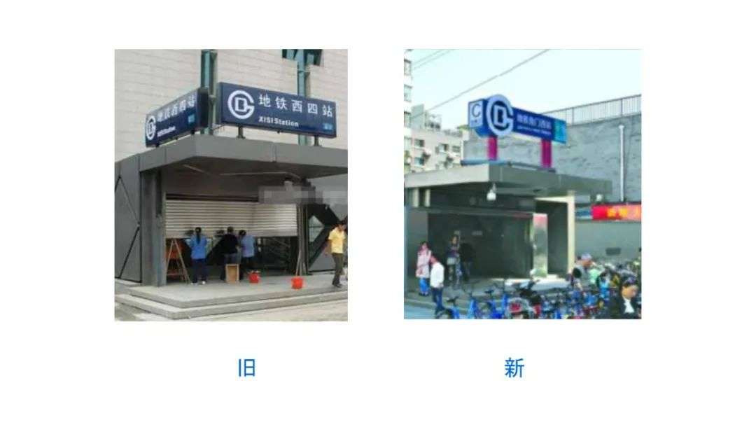
At the same time, because the background color is changed from white background to “technical gray”, or the original color glass is used directly, the contrast between the background and the logo is increased, making the shop sign more eye-catching from a distance. This is just like the fine-tuning of the external signboard of the Beijing Subway, and it also reflects the design principle of making the subway logo more eye-catching.
In the design of the Xiaomi canvas bag, the Xiaomi rounded rectangle logo can now be partially enlarged; but replacing it with a square logo will feel the oppressive sense of sharp edges and corners, which is very uncomfortable. Nightmares.
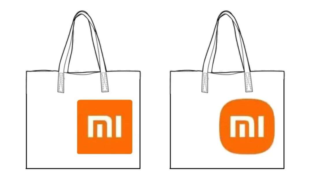
The VI designs in the 1990s all had similar problems. The font edges were sharp, took up a lot of space, and had a strong visual impact, but it might be really scary. The designs now adopted are generally more friendly, warm and humane.
Of course, the new logo application also has problems. For example, the WeChat official account after the new logo is changed. The place where the logo is displayed on WeChat looks strange:
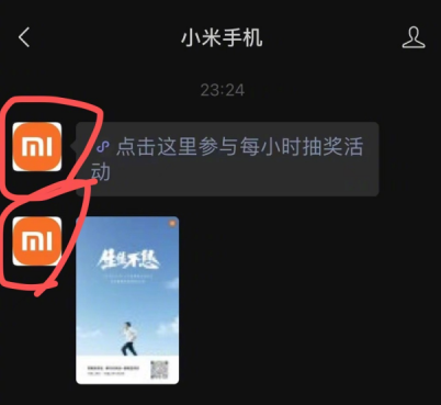
In this case, the entire rounded rectangle should be reduced to the extent that it can be fully displayed even in the round profile picture frame. In fact, the logo of the Hangtong News Agency is the same. In order to accommodate the differences in the avatars of different platforms, even if it is already positive and negative, there is a little blank.

Why develop a “design philosophy”
In the process of Xiaomi’s upgrade of the brand identity system, Hara Kenza proposed another design concept “Alive” after “Empty”, that is, a sense of life design.
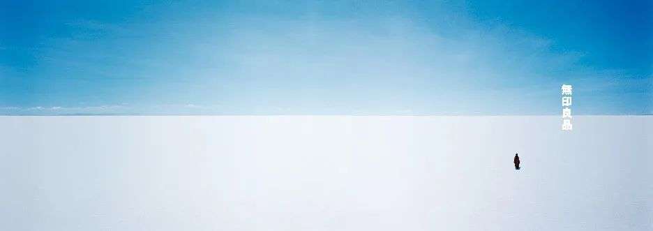
The idea of ”emptiness” is most accurately implemented in the shaping of the “MUJI” brand, which corresponds to the Japanese civilization that has undergone many historical “shuffles” and natural disasters, and is full of losses and regrets.
In China,The plan pays more attention to the power of rules, and will fix all possible problems in every detail. Even if the “soul” of the plan is drawn, it will not affect the application of other parts of the specification.
A typical example that the president can think of in this regard is the failed bid change of GAP, a major American clothing brand.
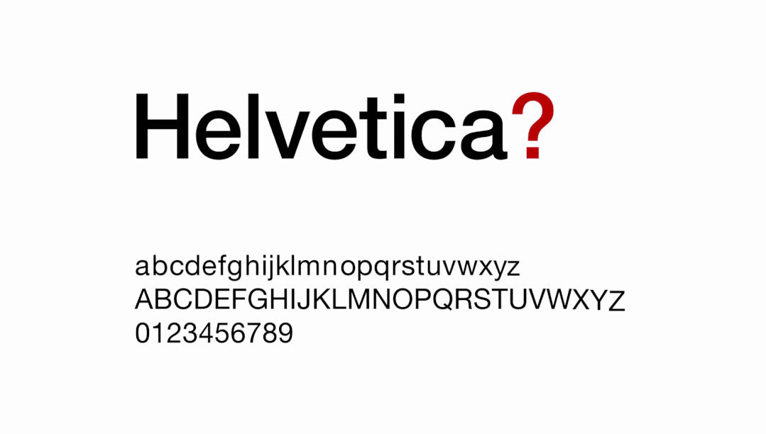
In October 2010, GAP released a new trademark to replace the old blue and white logo that has been used for more than 20 years. In order to rejuvenate the old store-this is the common demand of many old brands-GAP replaced the 19th century high-foot serif font with Helvetica.
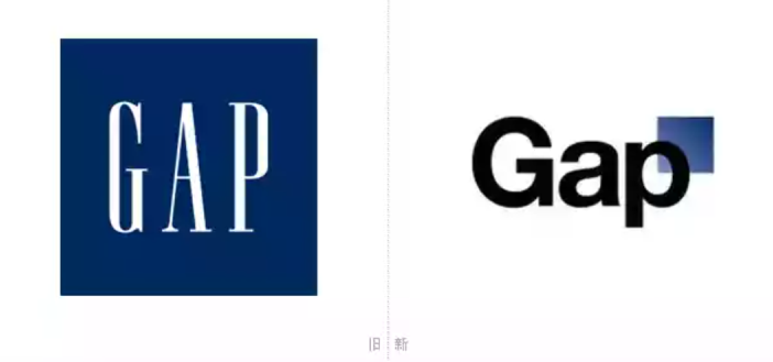
But this unwarranted decision quickly turned into a public relations disaster. Social networks are full of complaints about Gap’s new trademark. In just one week, Gap decided to withdraw the new bid, and by the way changed the person in charge of brand promotion, and appointed the first chief marketing officer in the company’s history.
The problem is that the money spent to make a full set of VIs cannot be spent in vain. So today, in addition to the abrupt classic logo, GAP stores continue to use the Helvetica / bold font style for publicity in other places. This is from the VI design specification that was originally spent.
In fact, the overall effect is not so unbearable, and the purpose of attracting and retaining young people is generally achieved. This has been misinterpreted by some people as “due to the timely rescue, the public relations disaster of the new bid did not have a long-term negative impact on the company.”
Is fashion a reincarnation?
Since we talked about the fonts of IKEA, BBC, and Gap, let’s talk a few more words. The trademark font is also a part of the brand design that must not be separated. Xiaomi also replaced the trademark font part this time.
Moreover, the “xiaomi” letter combination will be used in more scenes. In many models, the “mi” logo that originally had no frame will be replaced with the “xiaomi” text combination.
According to some statistics, for a period of time, East Asian countries like to use the pinyin letters of their names as trademarks, compared to European and American brands that use graphics as trademarks. The Latin alphabet creates a subconscious “exotic style” for East Asian brands.
Because the total number of Latin letters is limited, when designing VI for Western brands, it is easy to design 1-2 logo fonts at the same time. There is time to adjust the weight, serifs, and sans serifs. Come one set.
However, the modification of East Asian brands can often only design fonts for the few words that appear in the trademark. Brands design a whole set of East Asian fonts for themselves, which has only happened in recent years, and most of them have happened to technology Internet manufacturers.
Mobile phone manufacturers, Apple, Oppo, Vivo, Xiaomi, etc. all have customized Chinese fonts. Alibaba Puhui style, Tencent font and JD Langzheng style are also impressive. It can be said that it has reached this level: a screenshot of a mobile phone screen or an information map with a pinch of the beginning and the end comes out. You don’t need to write the author, you know which one it belongs to.
In terms of font design, there are indeed elements to inherit the spirit of enterprise and culture, but in general, it is not only necessary to adapt to printing and digital display, but also to have a permanent authorization of the font to prevent endless payment of copyright fees.
In fact, this will make the choice of fonts of different brands increasingly modest. Arial, CNN Sans, and Ping Fang are all variants of Helvetica and standard boldface.
In addition, printing and distributing various physical products, packaging, and advertisements led to a high cost of changing logos. New Zealand held two rounds of national flag-style referendums to remove the Commonwealth “M-flag”, but it was too costly.
If the distinction between the new and old logos is not too large, it can reduce the cognitive cost of consumers. The above complex considerations will also cause various expensive logos to be refurbished, and in the eyes of the final consumer, they will be about the same length.
Of course, Xiaomi has only been established for 10 years, so only fine-tuning is allowed. For companies that have been in business for 30, 50 years or more, the logo and its extended expressions show an old sense of the times, which is very normal.
At this time, the brand may make a big change to the whole logo visible to the naked eye. But at the 100th anniversary, some companies often use their logos 20 to 30 years ago, 40 to 50 years ago, so fashion is a circle.
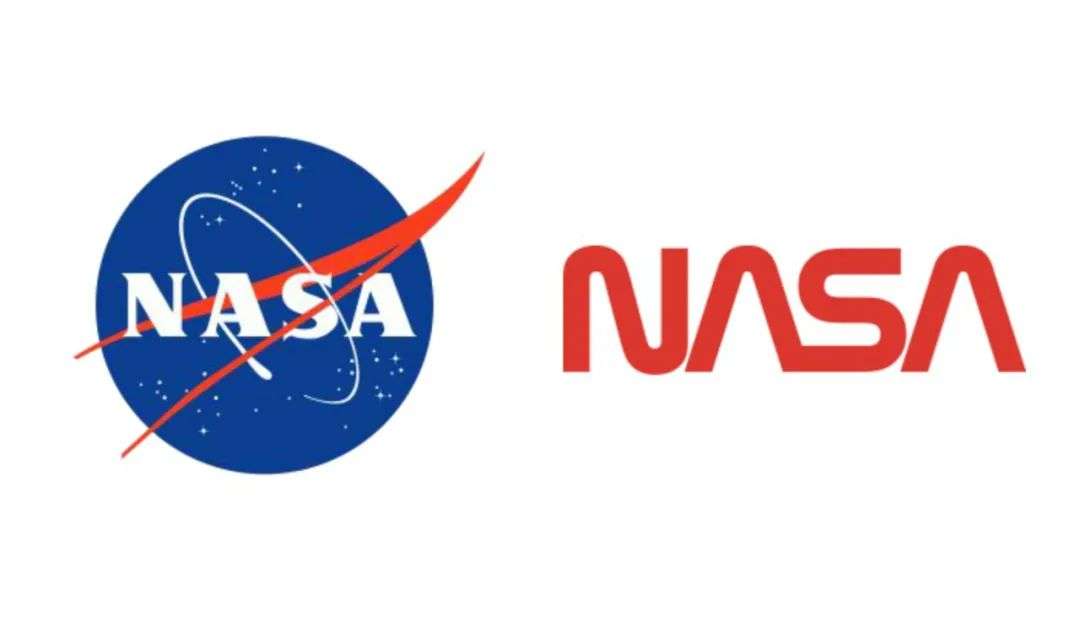
In the 1970s, NASA adopted the “caterpillar” logo, but the spacecraft that hung this logo may have violated feng shui taboos, and the mission was not very smooth. Later, it changed back to the old “meatball” logo. Interestingly, some of NASA’s small launches in recent years have used the caterpillar logo.
The design of a few logos is fortunate. It may be an element of the initial complex and cumbersome logo design, which is abstracted and has a minimalist style of modernism.
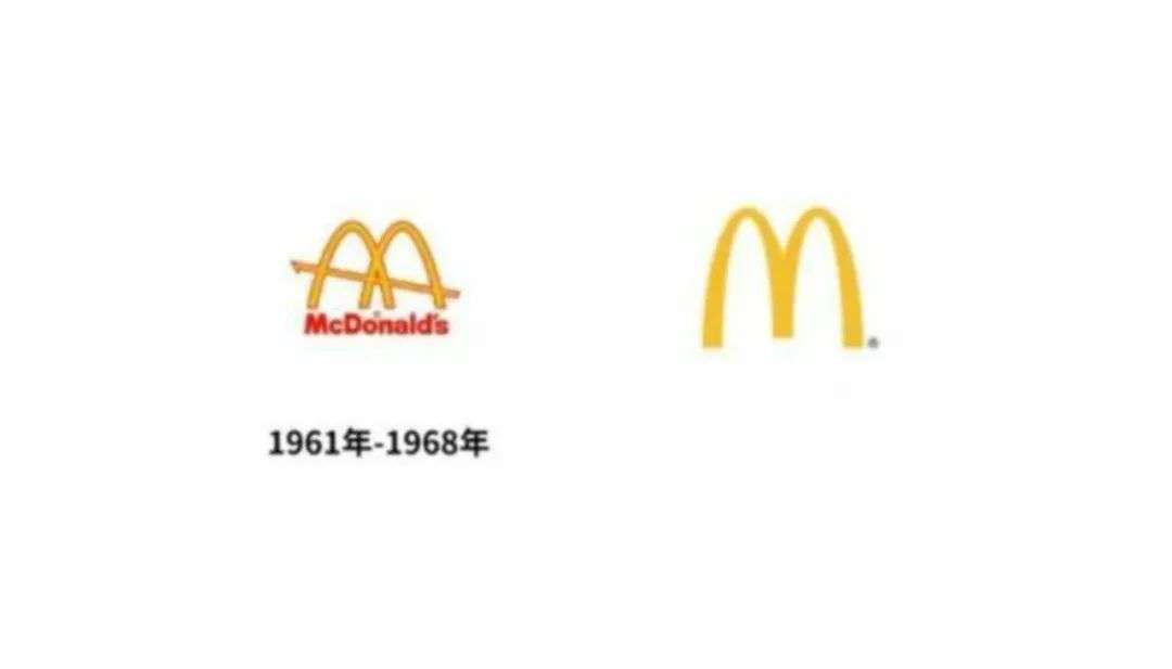
Looking at Xiaomi’s logo in this way, you will find that before the change of the logo, the two letters “mi” are often taken out of the rectangular package and used. This design from 2011 seems heavy and scary. But when it is always curled up in the rounded rectangle package, it is even more